Delta Museum XR App
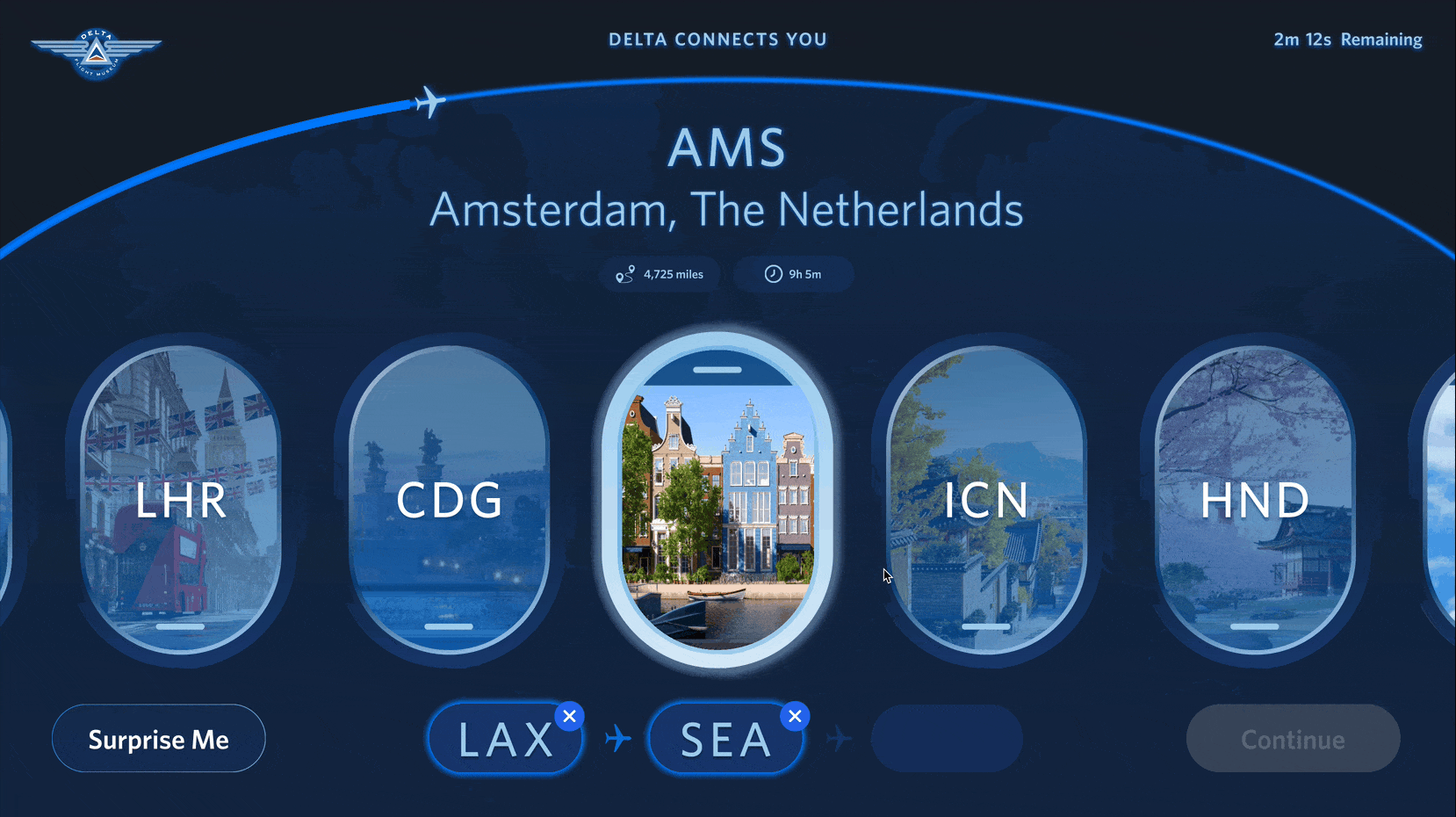
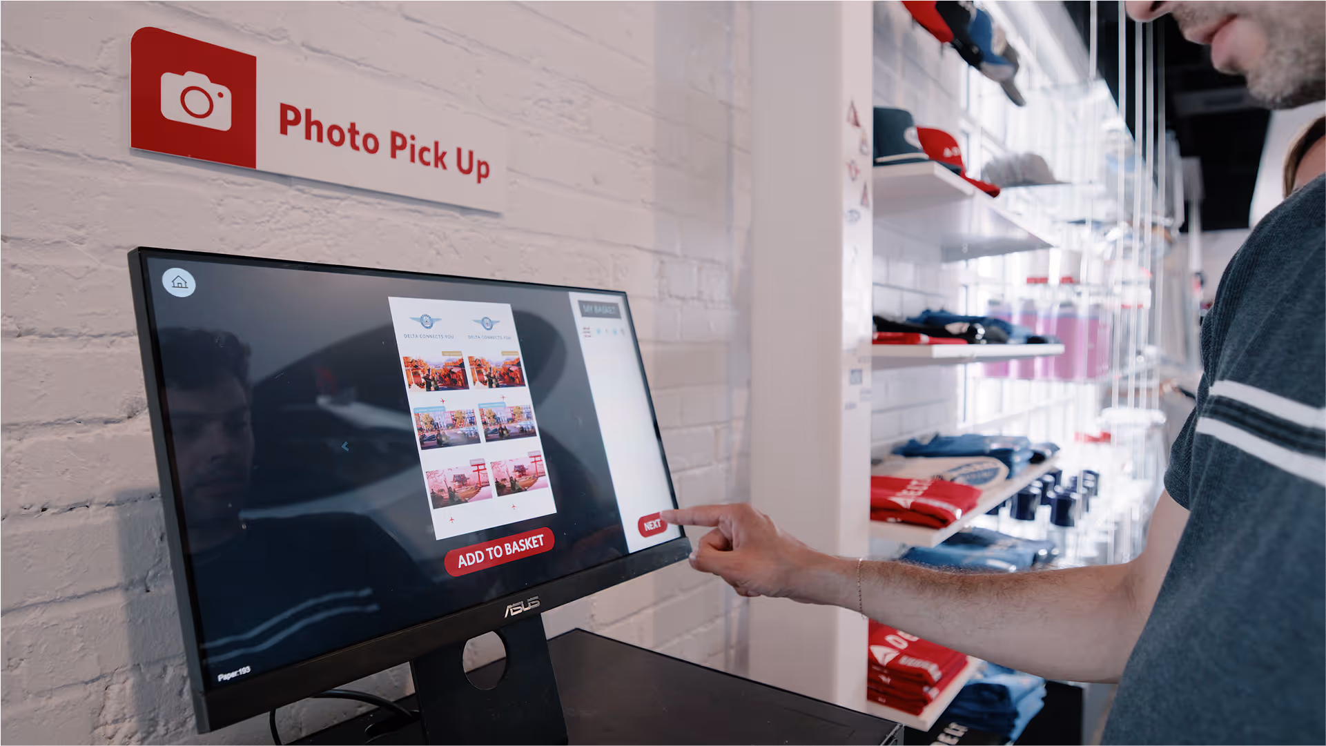
Touchscreen interface for the XR flight experience at the Delta Museum
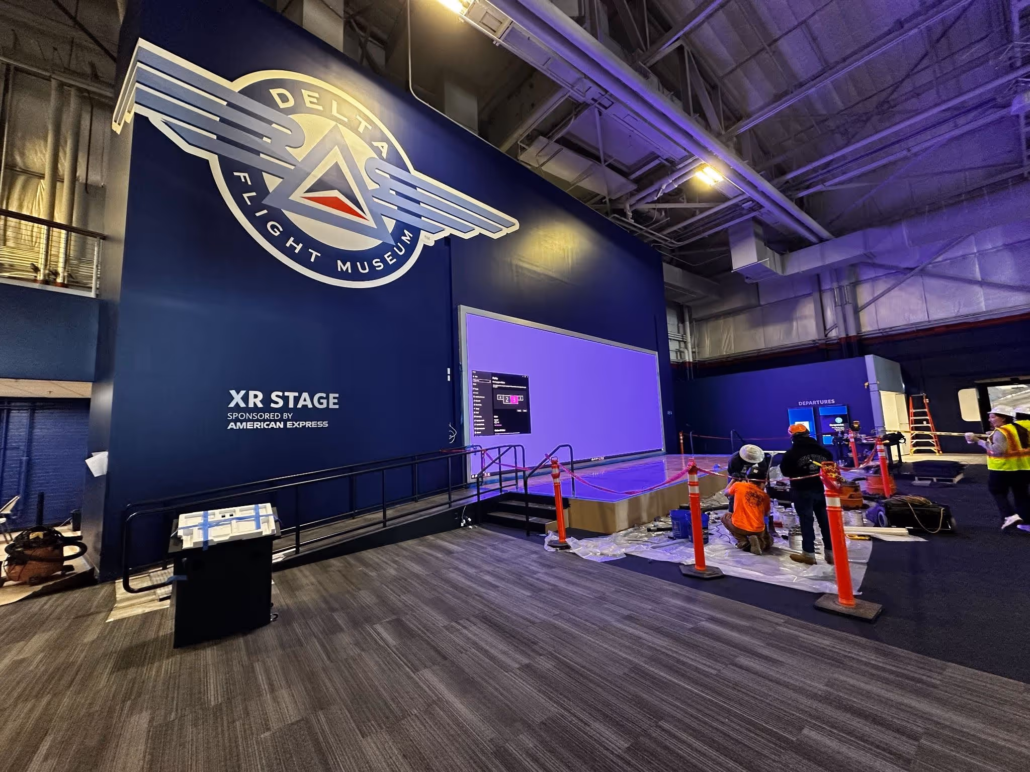
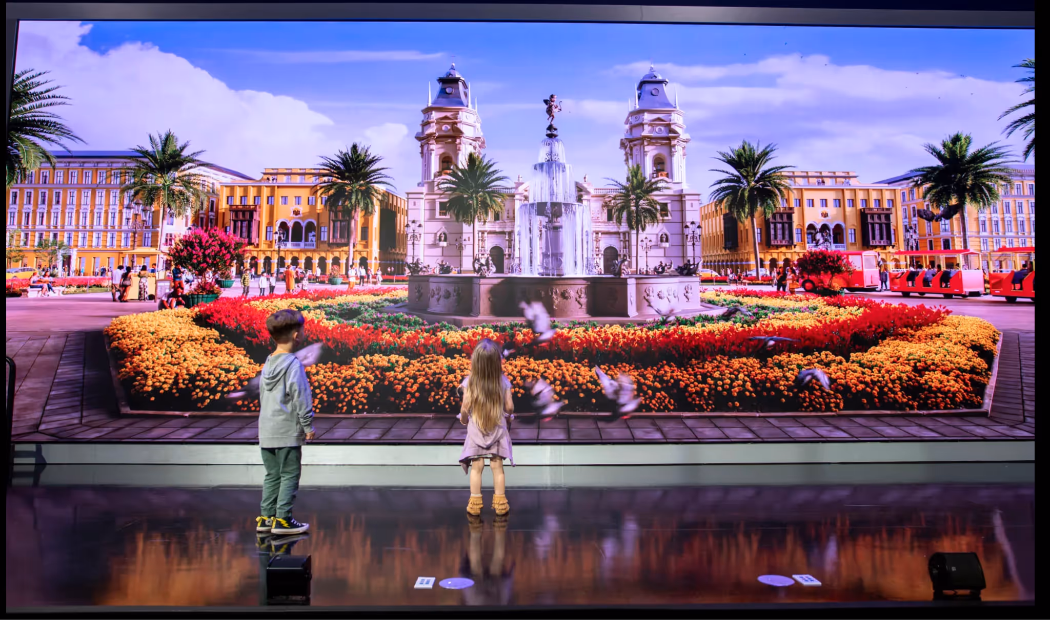
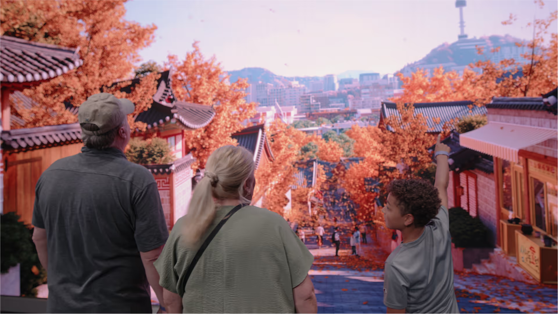
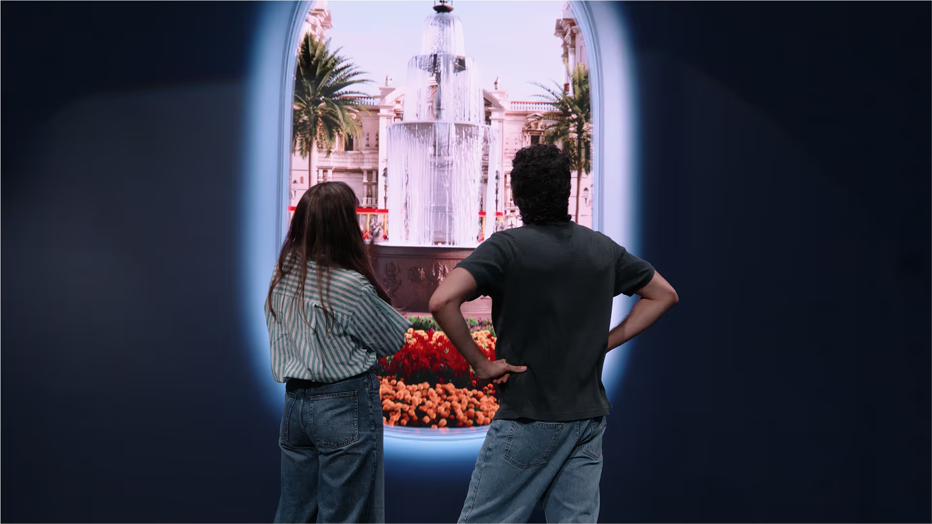
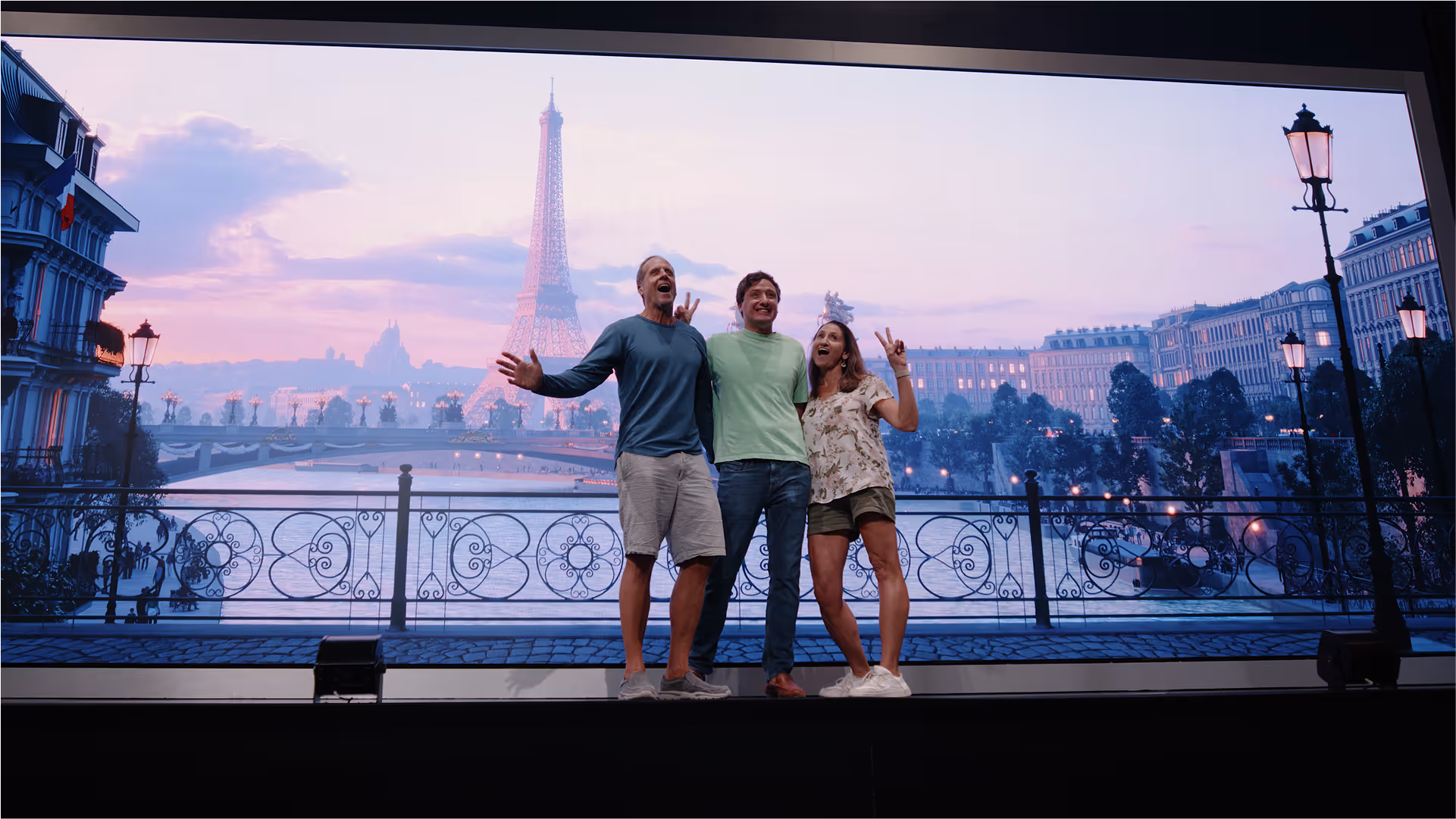
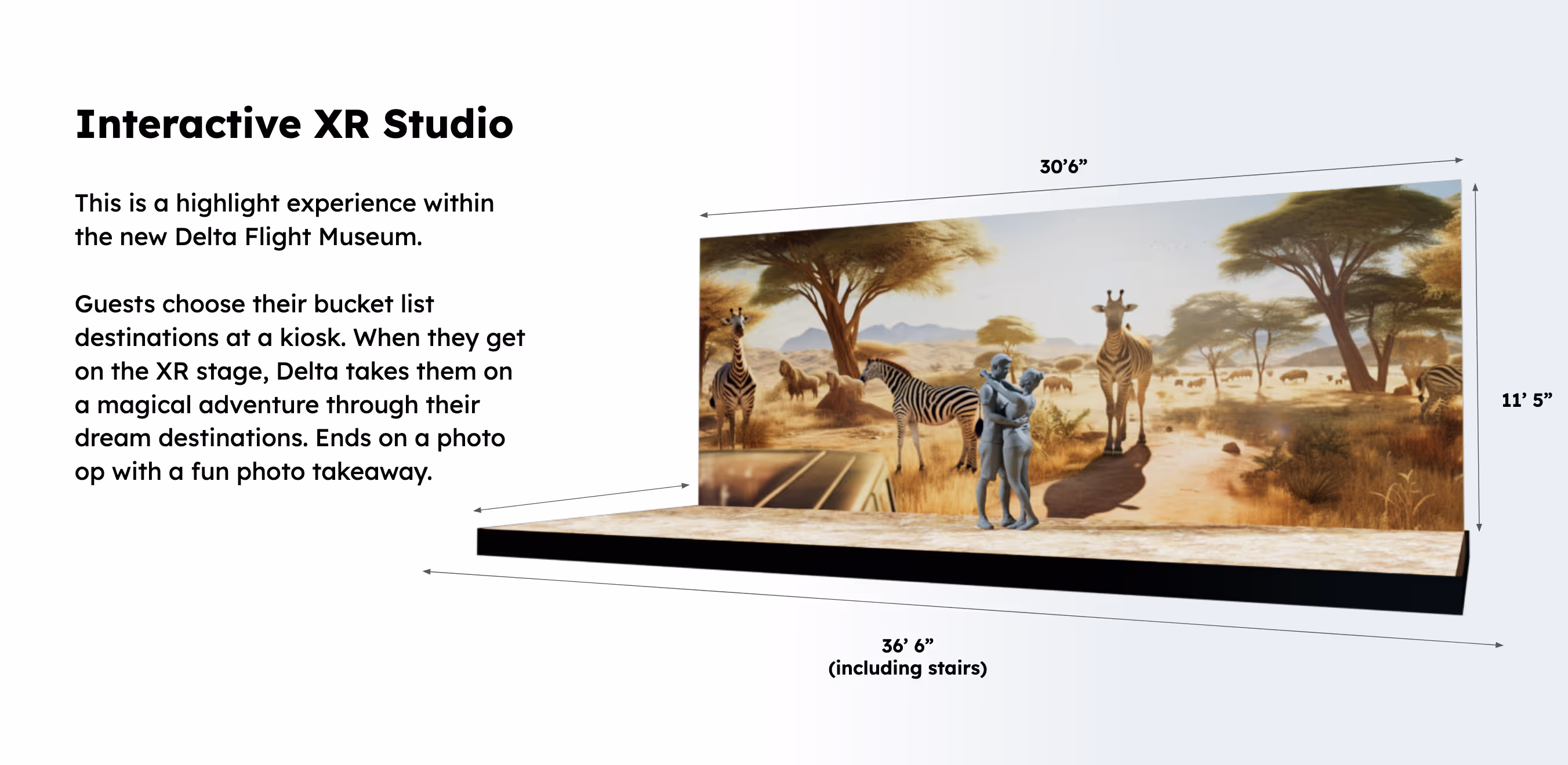
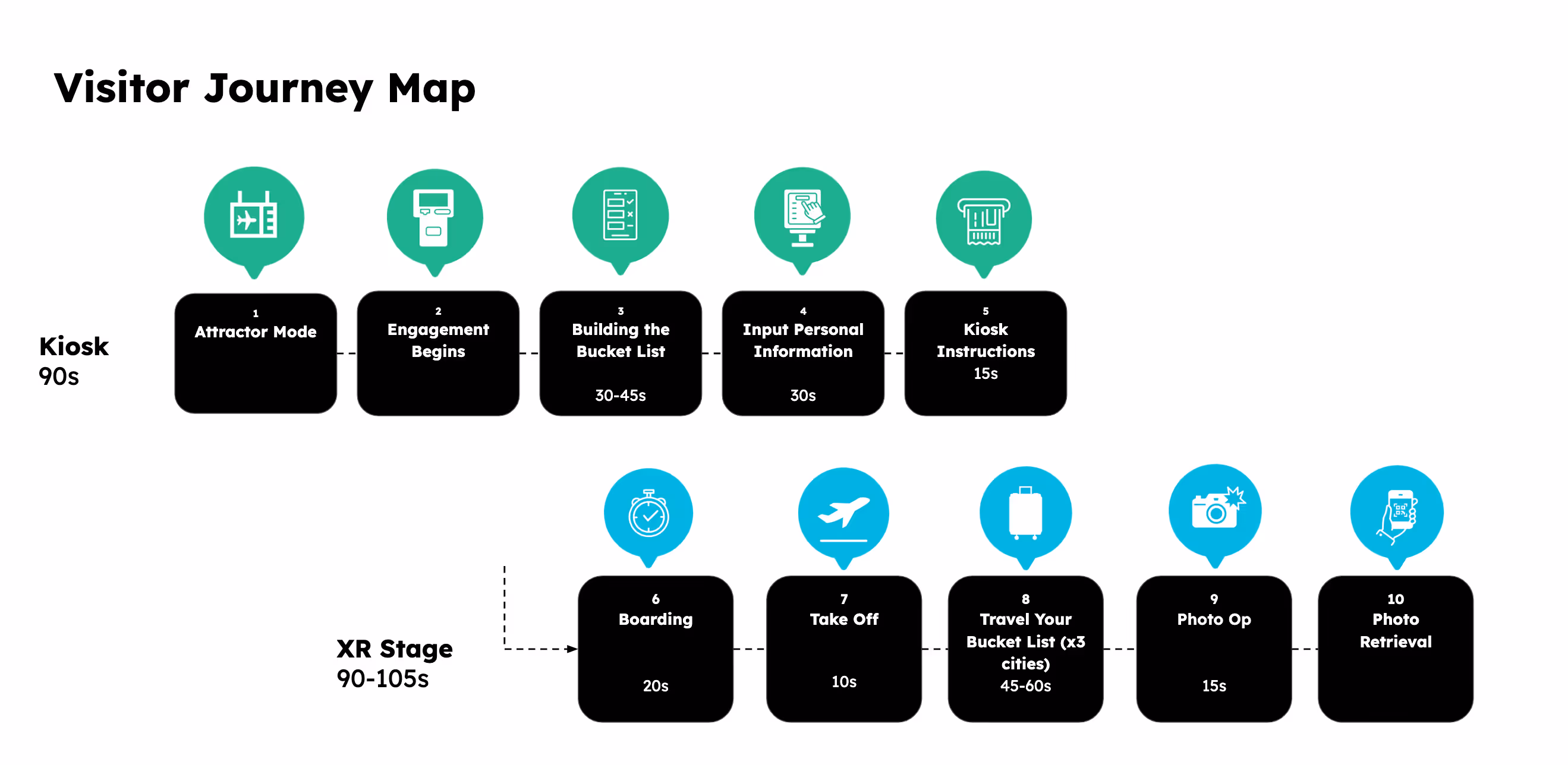
The Delta Flight Museum XR experience invites guests to experience an immersive, virtual vacation at 3 Delta-serviced cities around the world. Visitors build their itinerary at a touch screen kiosk, "travel" on a 60ft XR stage with 3D animated backgrounds, and take vacation photos on stage.
I owned UX and visual design for the itinerary-building kiosk experience. Throughout the project, I was responsible for visual explorations, conceptual wireframes, UI design, and high-fidelity prototyping for dev handoff.
UX design
UI design
Prototyping
Usability testing
QA testing
Figma
Frame.io
Unity
4 months
Live
In celebration of Delta Airline's 100th anniversary, the Delta Flight Museum embarked on a $20 million transformation aimed at revitalizing the visitor experience with enhanced galleries, digital media, and hands-on experiences designed to engage aviation enthusiasts, families, and history lovers alike.
The Delta Museum had been around for years but had not made any meaningful updates to its exhibits in over a decade. They wanted to keep visitors coming, and also attract a new audience beyond the usual aviation enthusiasts and families. The museum board took Delta's much publicized 100th anniversary as an opportunity to refresh the museum experience and drive visitor growth.

Create an interactive visitor experience sending guests on a bucket list trip through twelve Delta destination cities around the world via an immersive, extended reality (XR) stage.
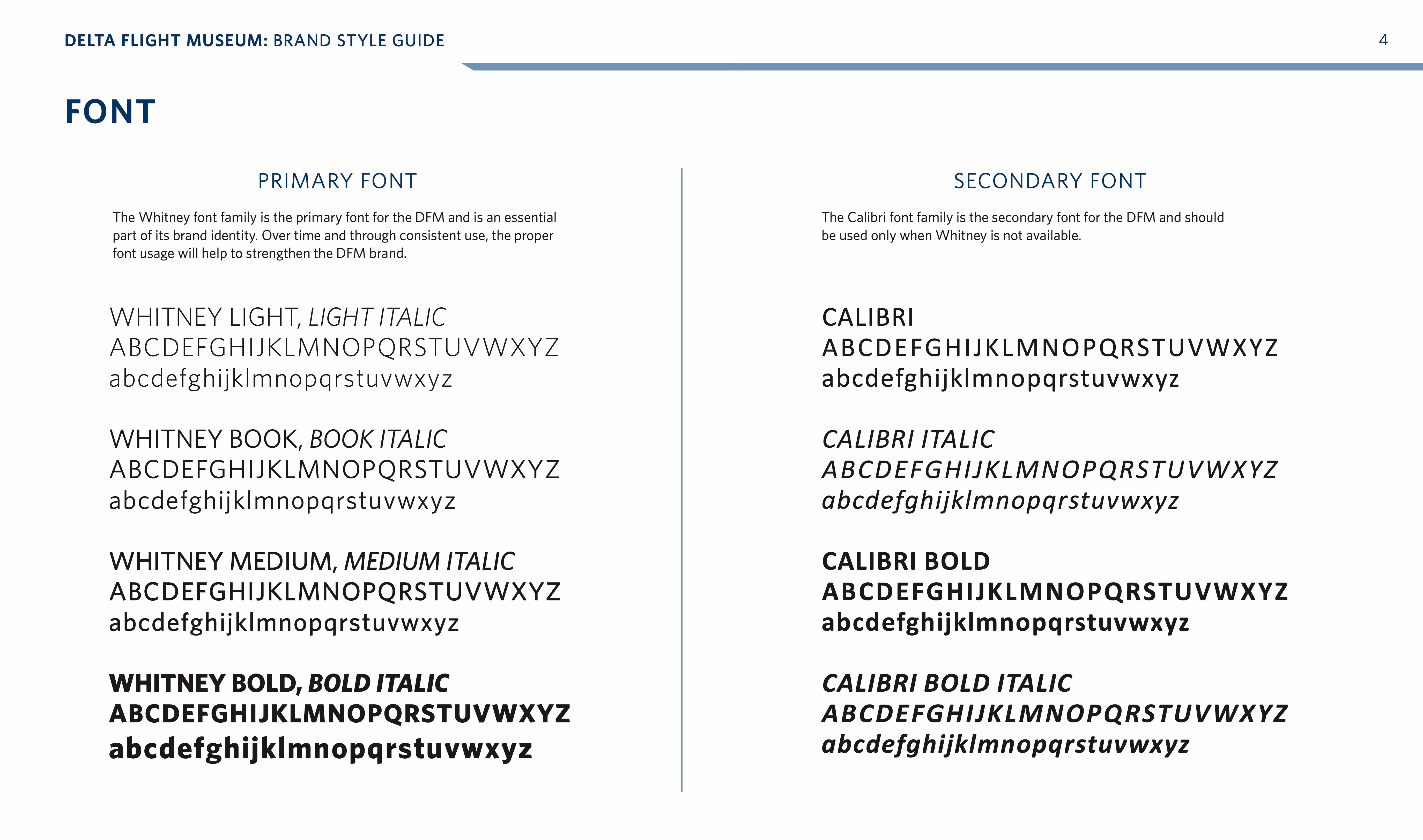
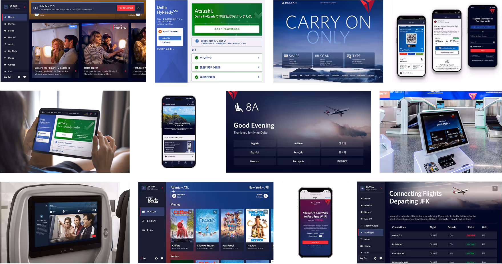
The Delta Museum team had a strong interest in bringing new, high tech experiences to the exhibition space, but wanted the look and feel to tie in neatly with Delta branding. I collected visual guidelines from the museum and deep dove into comparable digital experiences across the Delta ecosystem.
Our creative team formed an idea: guests embark on a trip around the globe with Delta Airlines, through the use of XR.
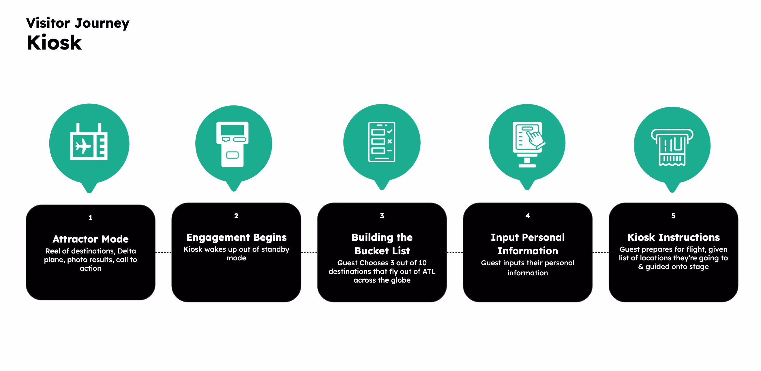
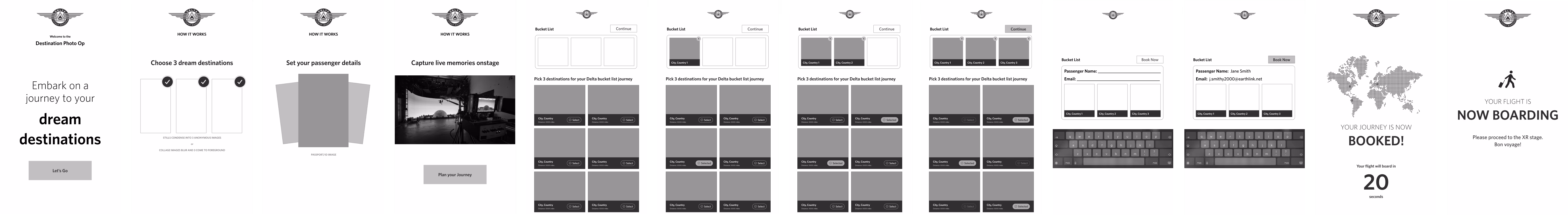
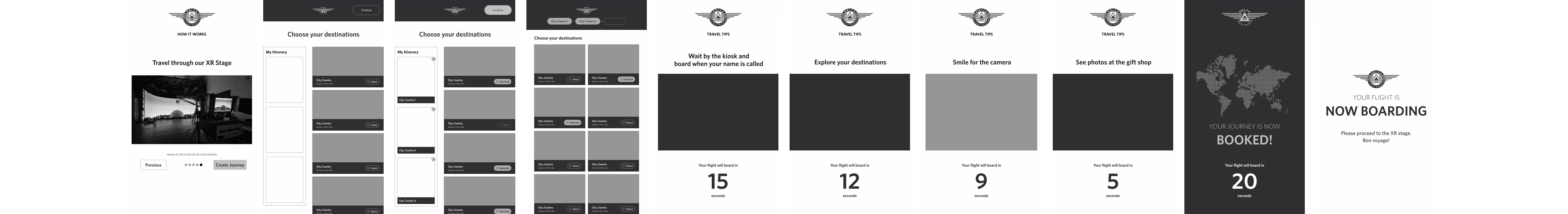
1. Guests choose their bucket list destinations at a kiosk
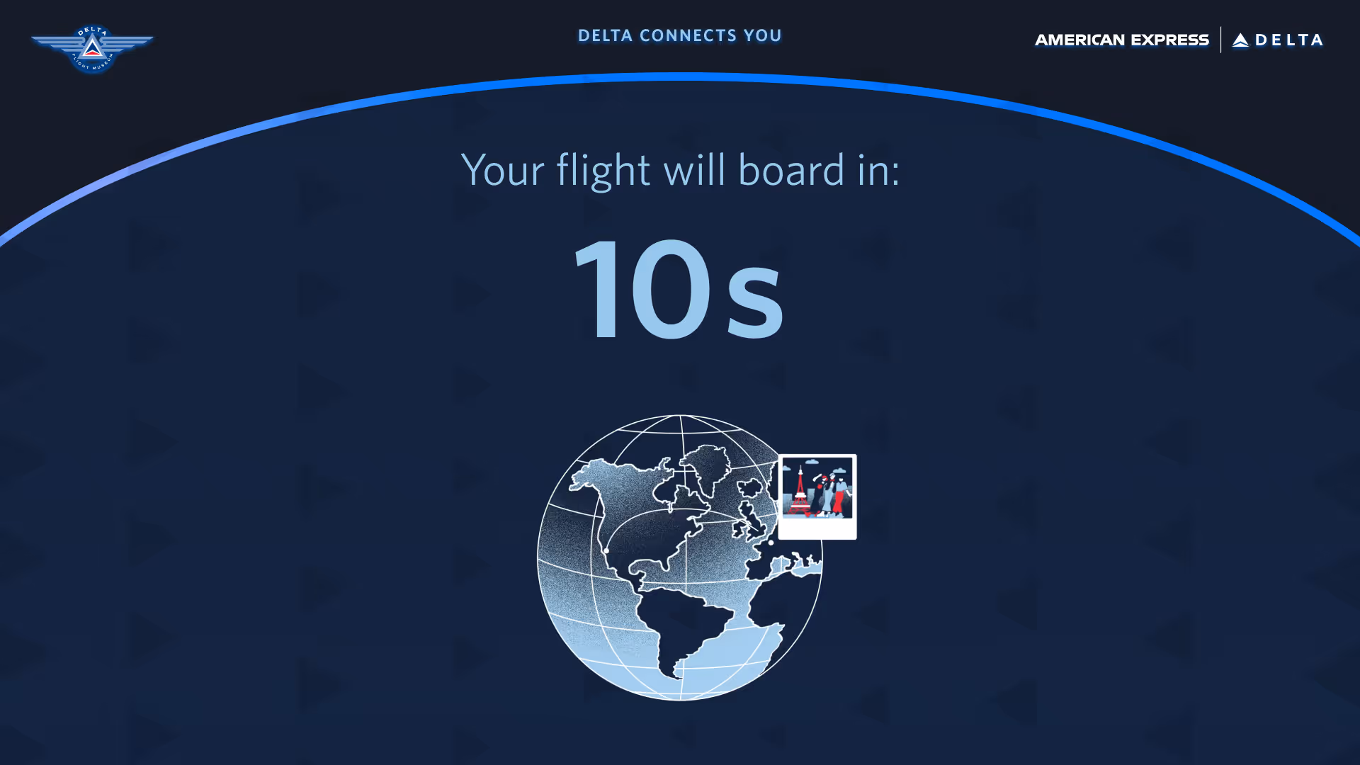
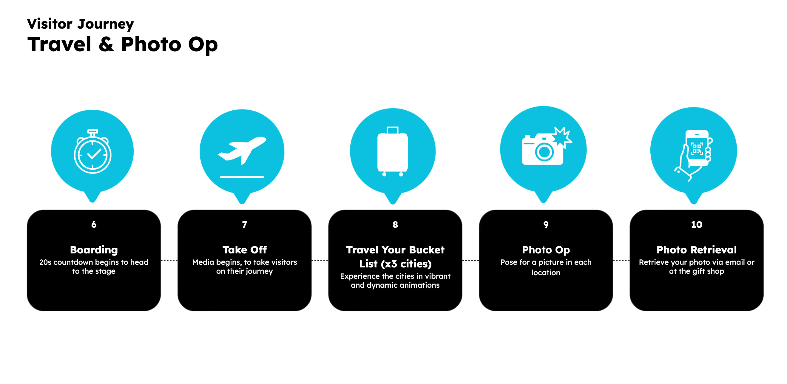
2. Standing on an XR stage, they are whisked away on a magical adventure through their dream destinations
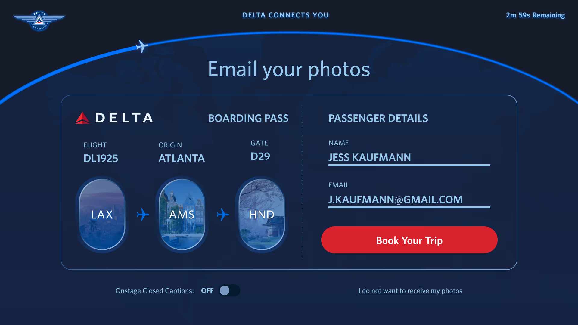
3. The experience ends on a photo op with a printed photo strip takeaway
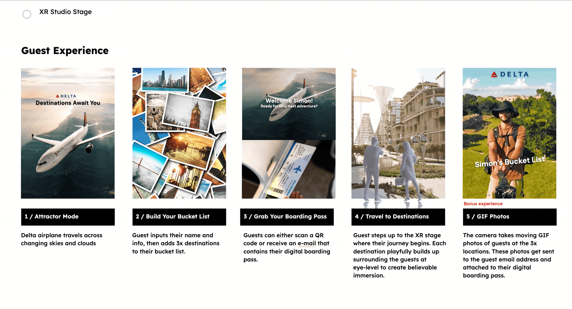
The experience would consist of two congruent parts: The kiosk experience, and the stage experience. I mapped the individual journeys and handoff, keeping in mind the museum team's desired < 5 minute total time limit.
Create a touchscreen application where users browse global Delta cities, build a three-city itinerary, and input their contact information for emailed photos.
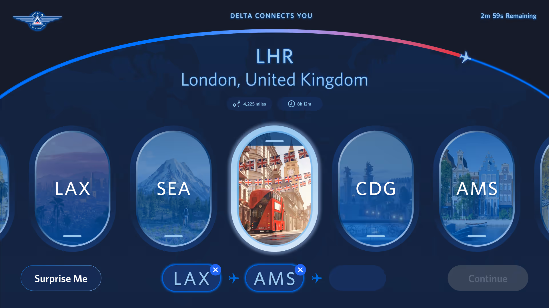
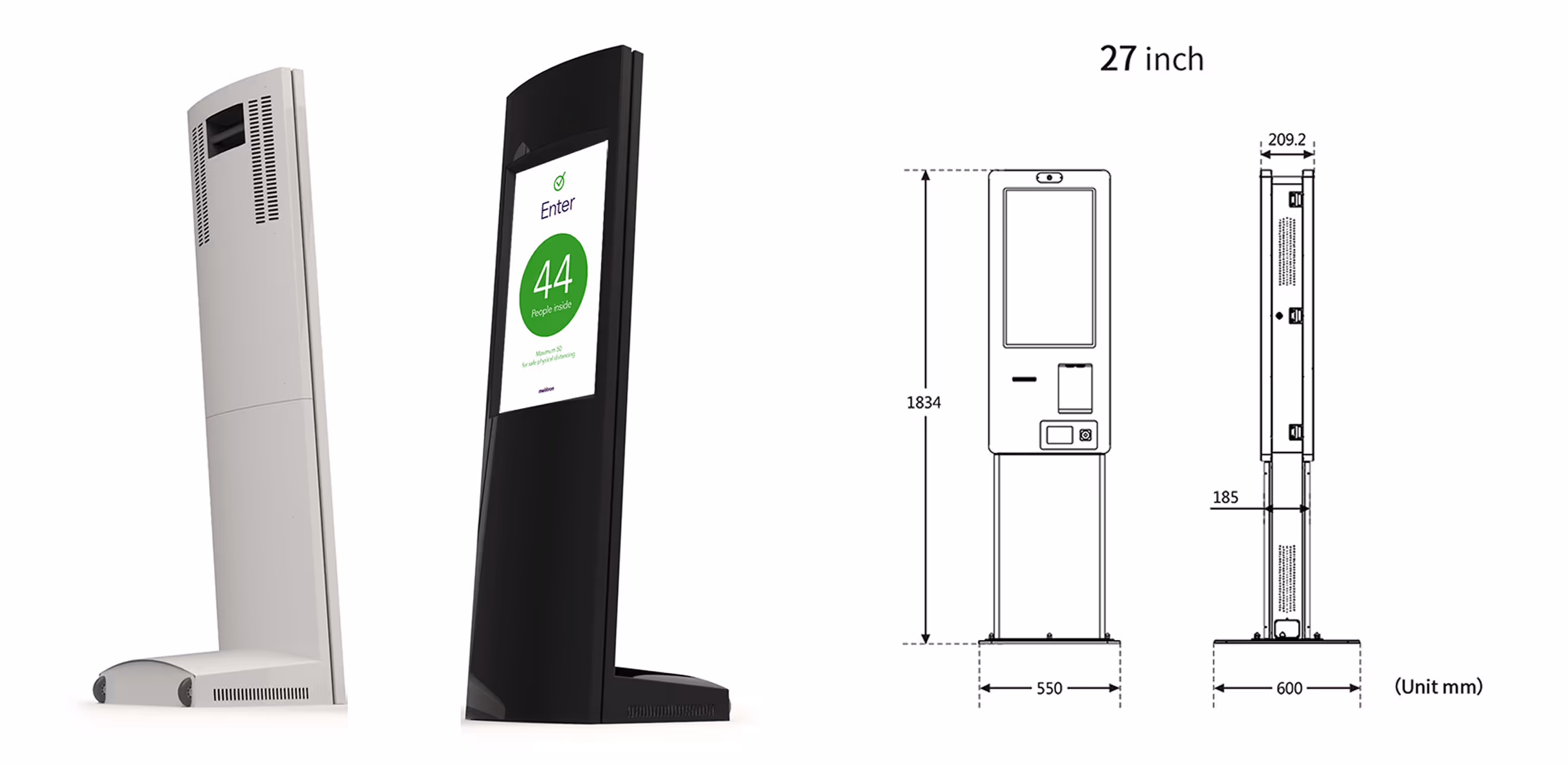
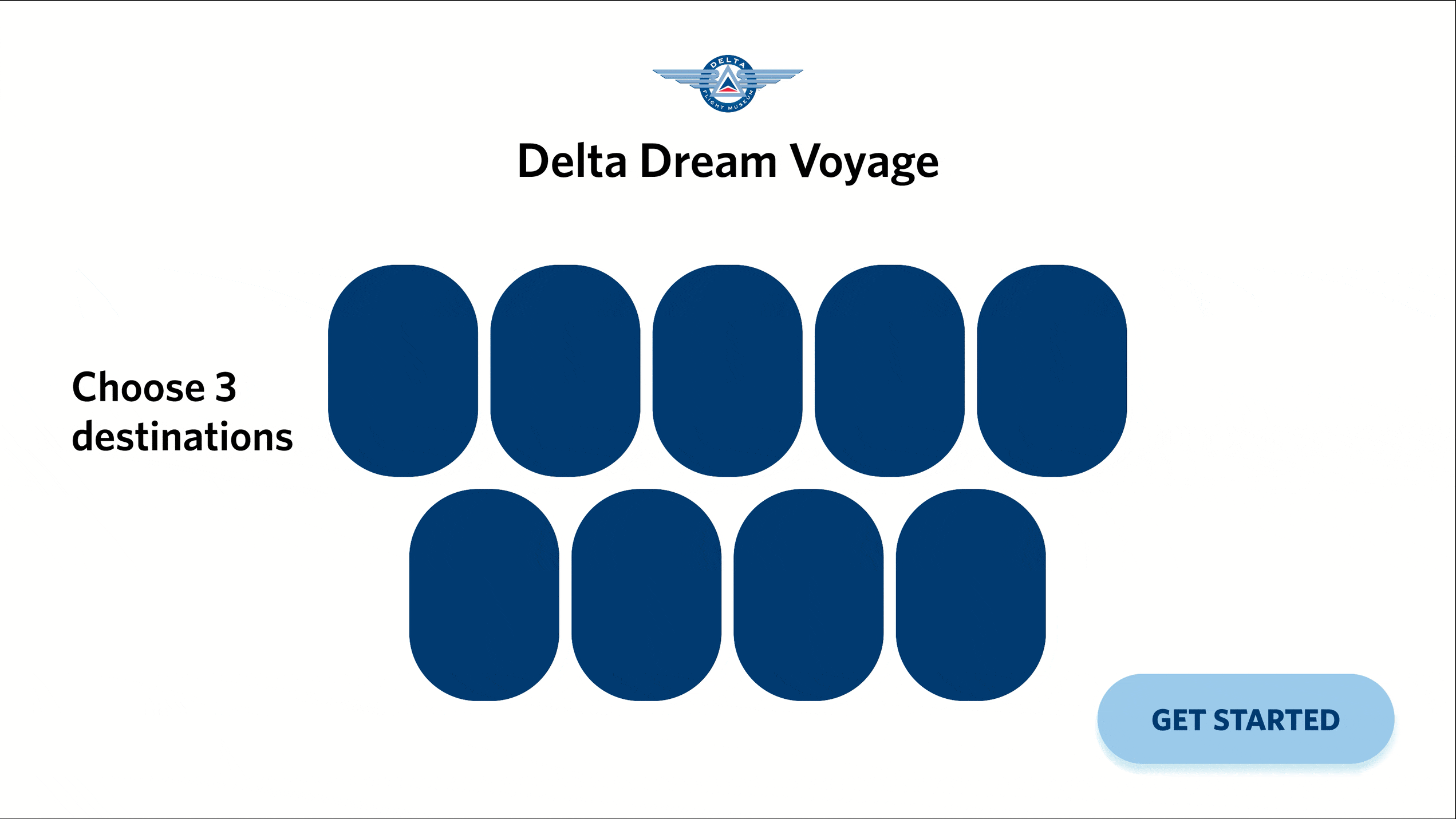
With the high level experience mapped out, I started out on wireframes. Hardware had already been specced out to a 27" kiosk touchscreen in portrait orientation.

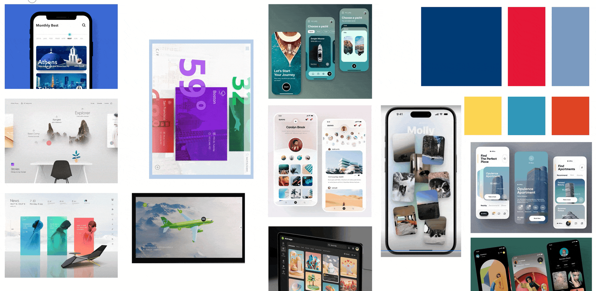
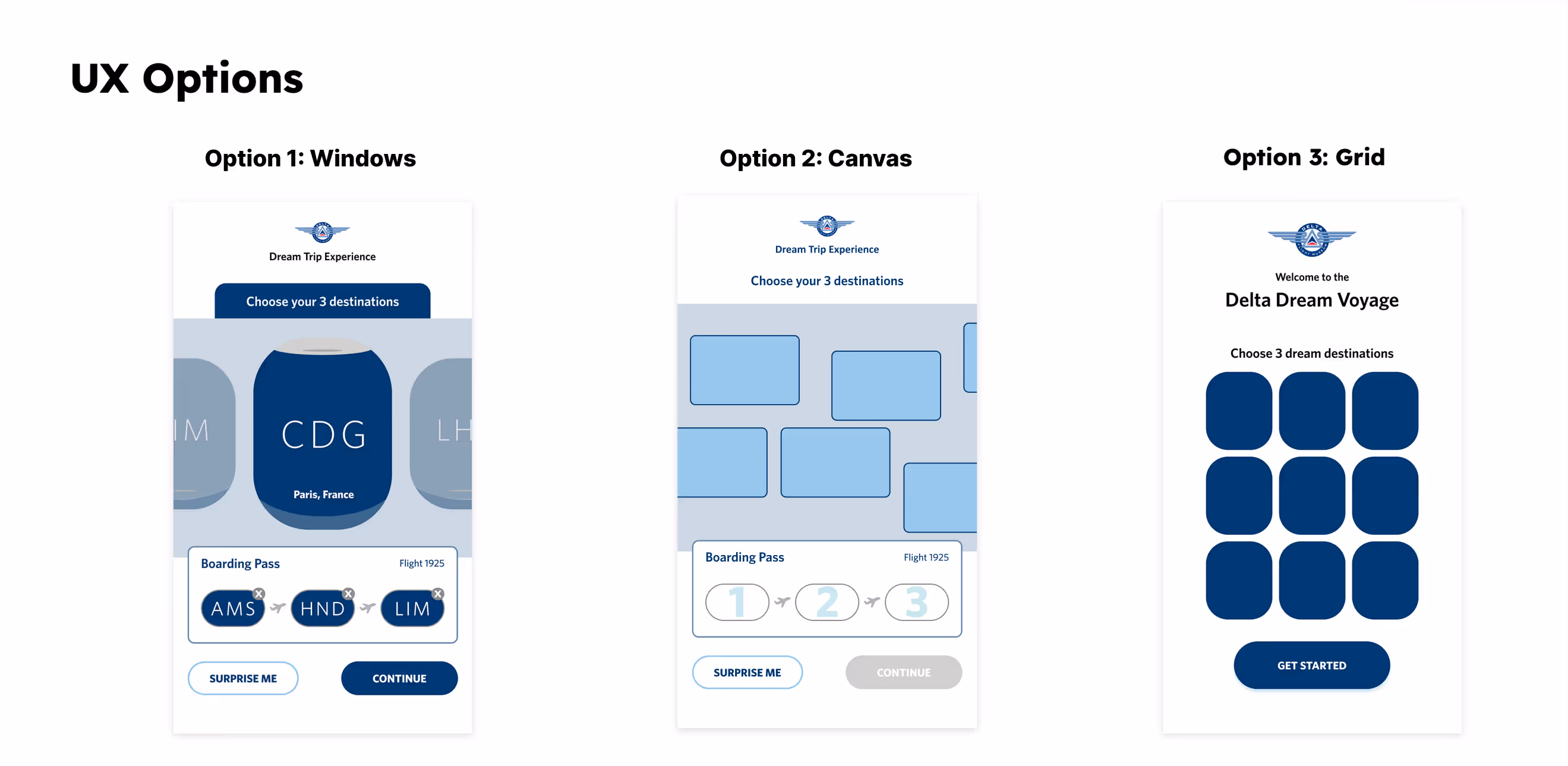
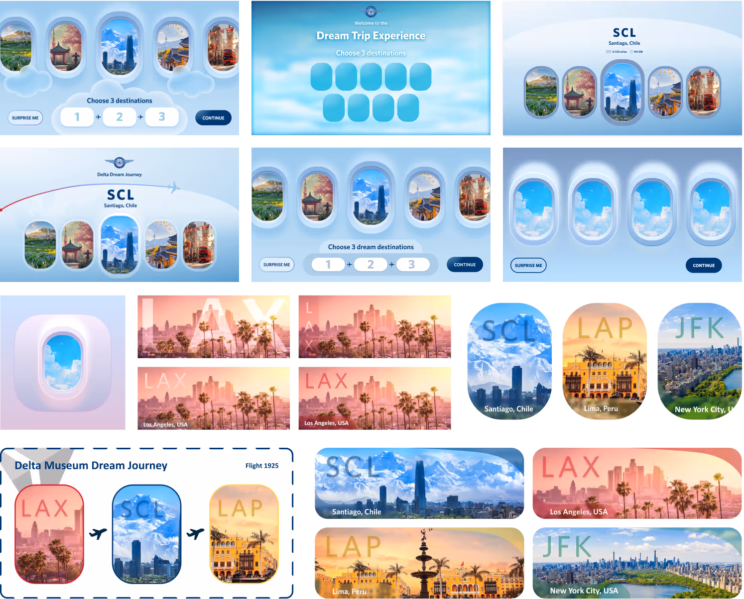
I built a moodboard to settle on look and feel with my creative director, pulling in motion design examples and color palettes. Then, I explored several layouts testing gallery styles, browsing interactions, and information display.
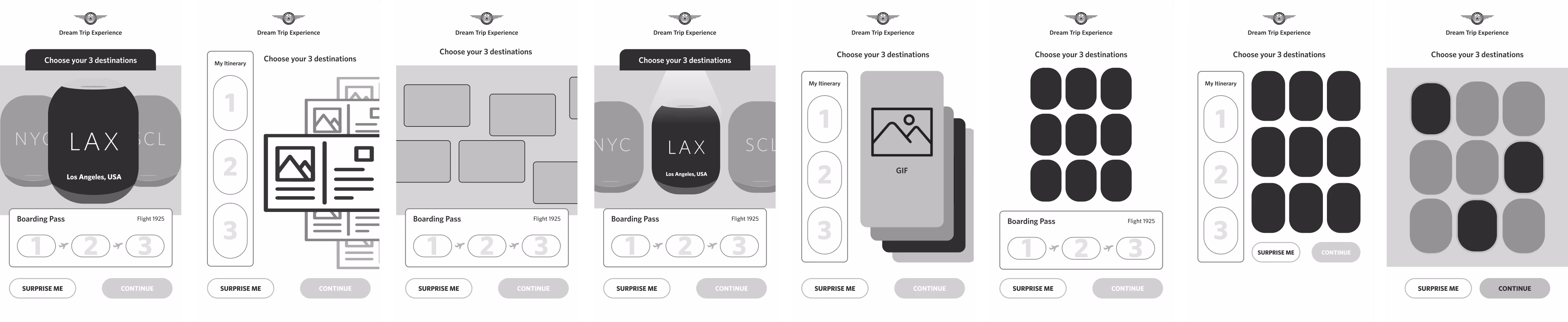
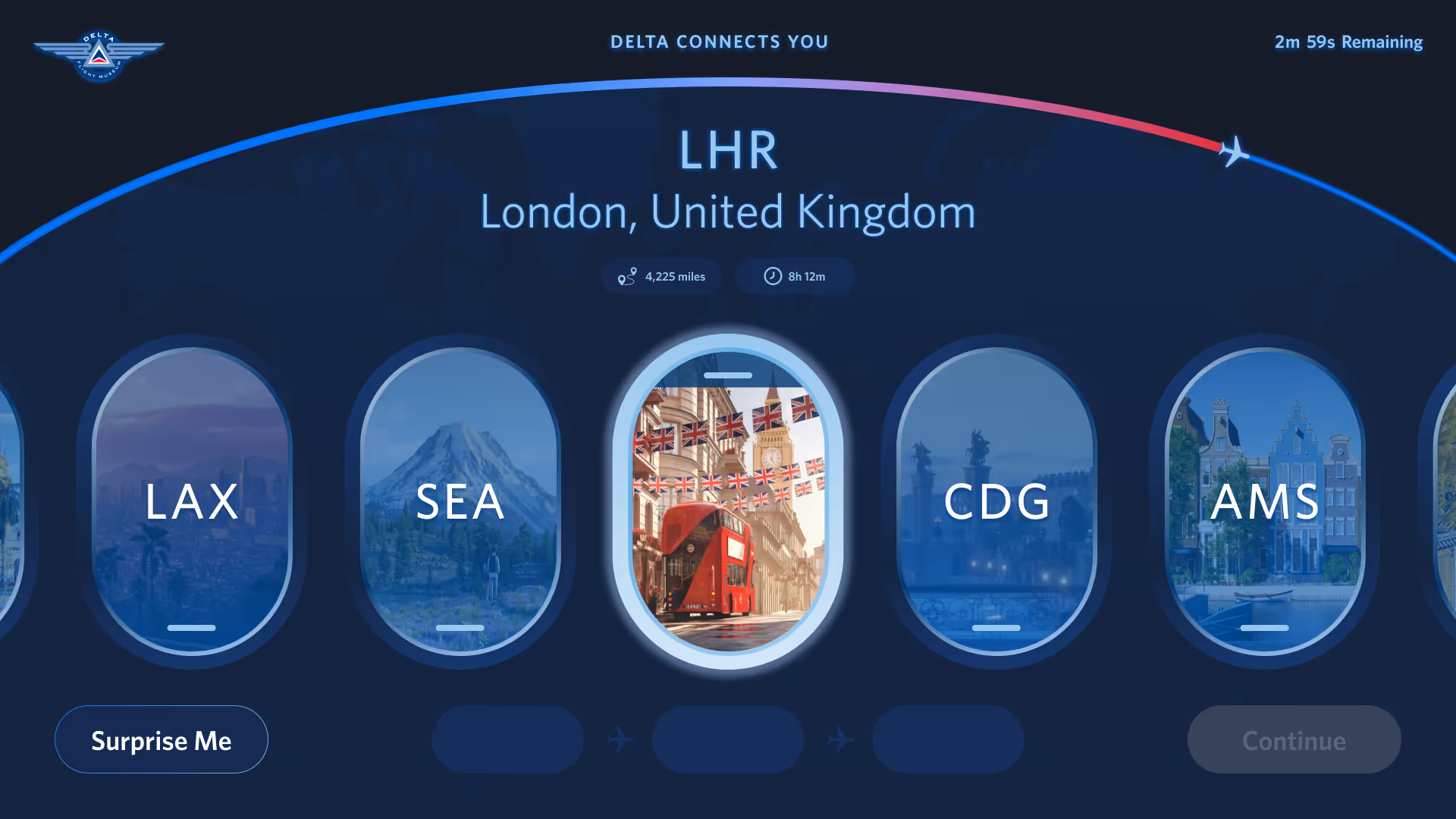
Having churned out a few options, I synced up with our creative team, and presented three options to Delta Museum stakeholders. They unanimously chose the Option 1, finding the cabin windows motif fun and aligning with the on-stage XR "flight" experience.
This was my first time designing for a static kiosk. With an accessibility-first mindset, I read up on the ADA kiosk guidelines and realized a vertical layout was not the most inclusive option. Continuing with vertical would require isolating interactivity to the lower 1/3rd of the screen only, or building an accessibility mode into the interface.
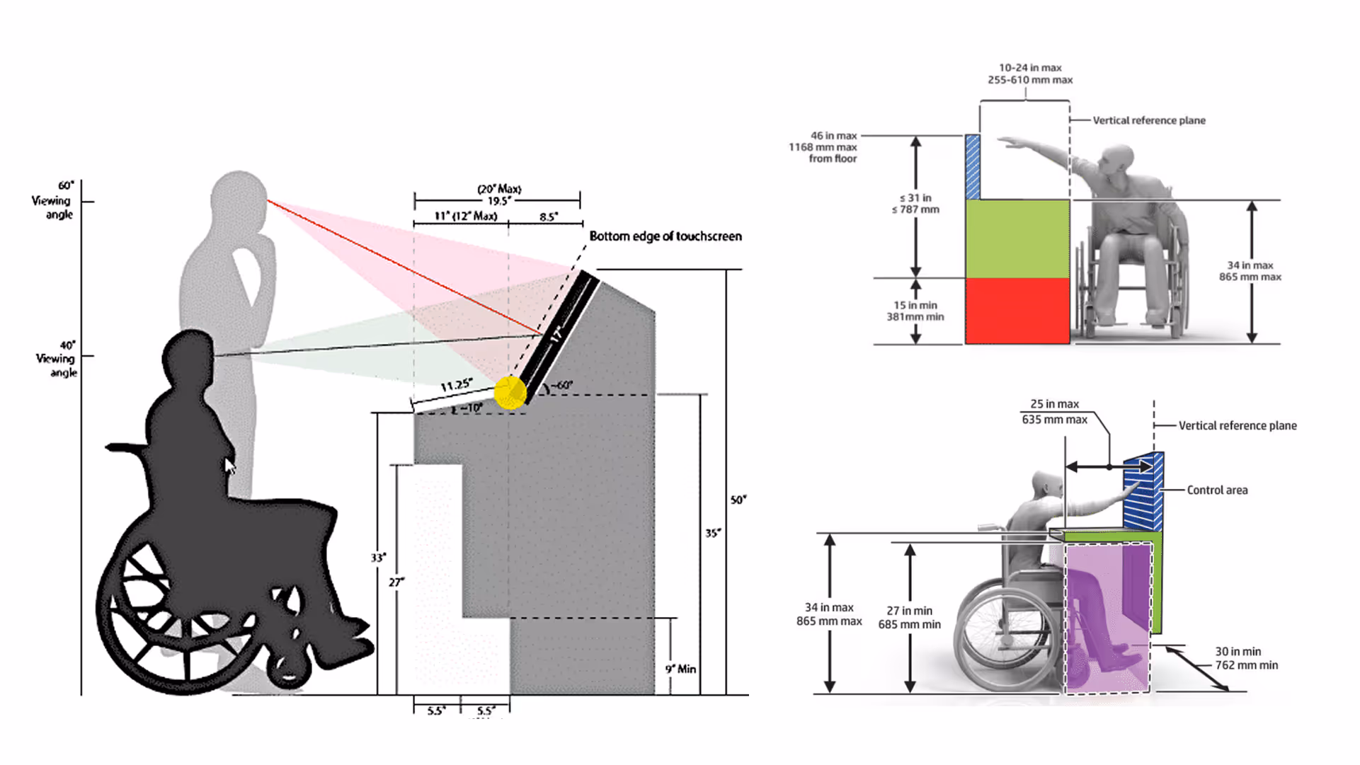
We did not have the scope or budget for additions to the development cycle, but hardware had yet to be locked in and purchased. I worked with the project producer to share my accessibility concerns with the client, and advocate for a horizontal kiosk screen instead.
This shift to horizontal layout actually worked out in our favor. Horizontal orientation paired nicely with the cabin windows concept chosen by the client. I could fit more than three windows into the viewport, meaning easier selection and less scrolling for users.
Initially, Delta Museum stakeholders requested that I stay close to Delta branding and graphic guidelines. I shared my early explorations into this visual style with the client, and received some interesting feedback:
The look and feel was too similar to Delta's existing digital applications. The experience was too realistic and similar to Delta booking apps, potentially confusing or boring museum visitors.
We met with the museum team to discuss a new visual direction and align on a path forward. We agreed to try something fresh, different, and playful, trying to shed the stiffness and serious tone of the museum exhibits and Delta branding.
To complement the ongoing airplane windows motif, I opted for a pastel-dusted "in the clouds" theme, leaning into magical realism and immersive virtual travel. This visual concept didn't connect with the museum team either– the original designs played it too safe, but these new ones were too experimental.
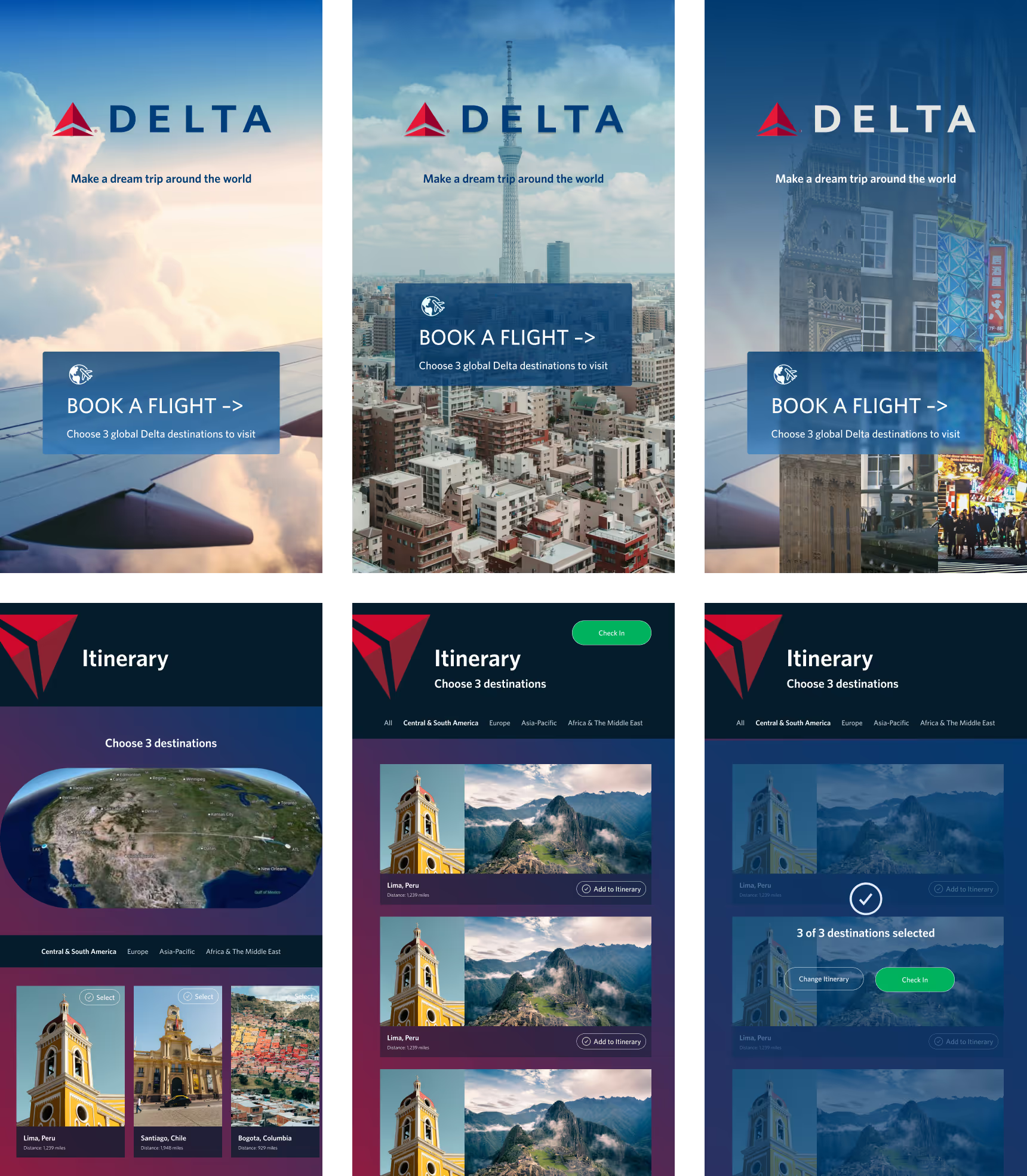
We synced with the museum team to course-correct and align on using Delta branding colors to create something whimsical and fun, but down to earth.
The kiosk app would feel at home in the Delta family, while the XR stage experience would pull in richer color palettes inspired by the cities themselves.


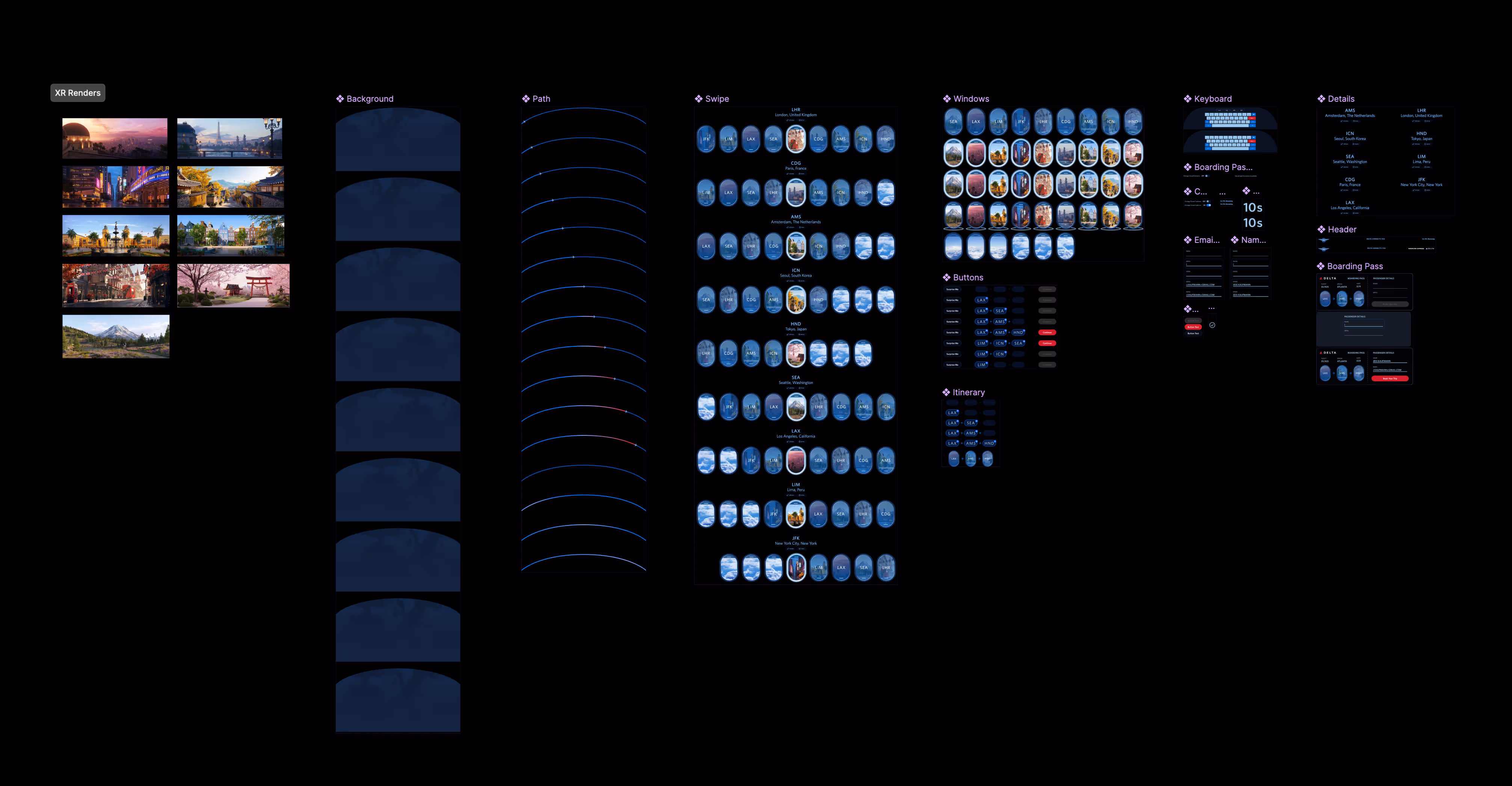
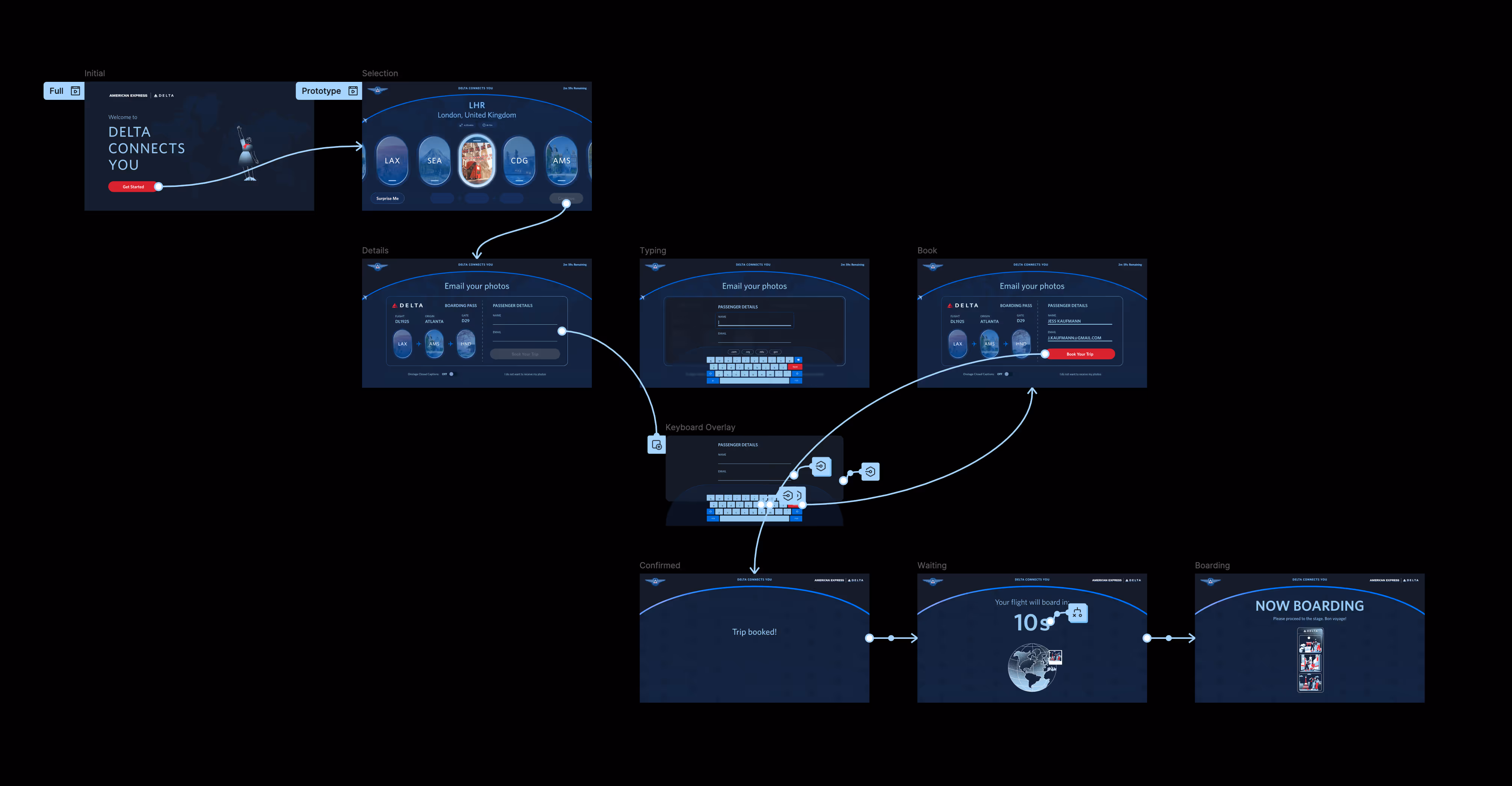
I finalized my designs with updates per client feedback, built a realistic variable-powered prototype, cleaned up the component system, and packaged it into a dev-ready file with annotations for handoff to our Unity development team.
To conclude the project, our team went to oversee the exhibition install onsite at the museum. We did hardware checks, a holistic QA testing of the entire XR stage experience, and got to take home our own photo mementos. If you ever find yourself in Atlanta, make sure to head to the Delta Museum and try it yourself!