Google Launchpad
A platform democratizing tech with free technical training and career preparation
Google Launchpad is a web platform helping users develop cloud technology skills, gain formal credentials, prepare for a new career, and connect directly to real job opportunities with Google partners.

In my lead designer role, I owned the UX vision and experience design from research and discovery through client delivery. I collaborated with a Huge Inc. team of strategists, developers, and creatives through multiple design sprints.
Research
Vision
UX design
UI design
Figma
Dovetail
Airtable
Google Workspace
6 months
Hand off complete
Create an accessible & inclusive web app that engages and empowers learners with the skills and support they need to secure tech careers.
Existing open learning platforms leave users stranded between upskilling and employability, especially those from underrepresented backgrounds and non-traditional educations. None offer a full, supportive journey from credential-earning to job applying.
Our discovery phase kicked off with documentation review and Google stakeholder interviews. I worked with our strategists to conduct and synthesize these interviews, uncover strategic business goals, identify our core audience, and understand the challenges they faced with online learning.
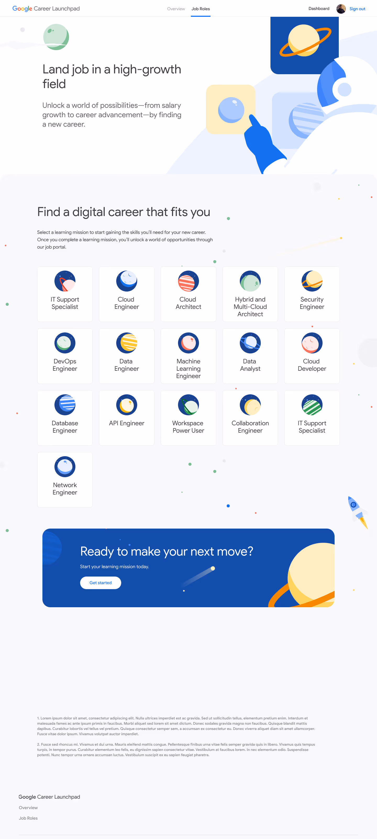
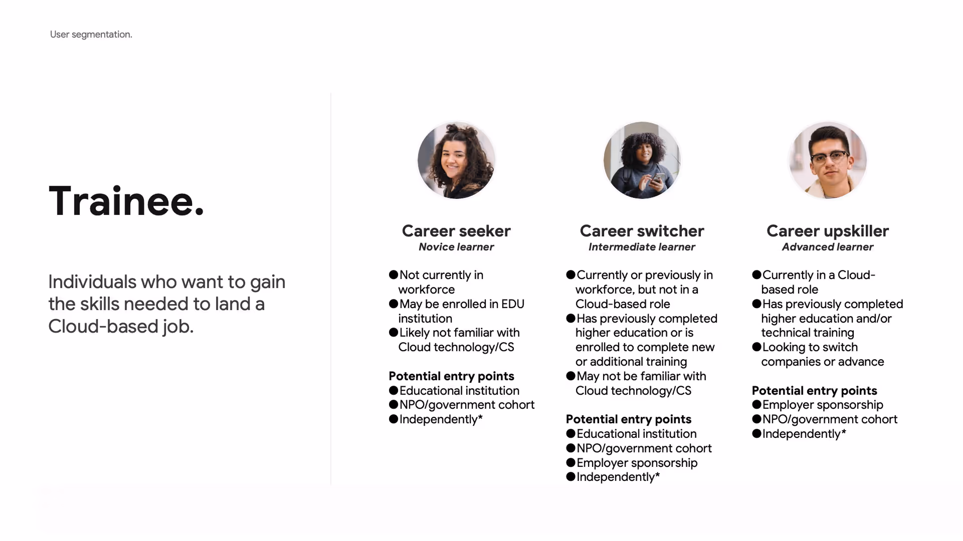
The interviews showed that our intended audience was diverse. To set our product vision, we explored user segmentation. There were two main high-level user types: The Trainee, someone looking to gain skills, and the Partner, someone facilitating learning– like an instructor or a nonprofit group.
In discussion with the Google team, we decided to focus the initial MVP on the Trainee user. Expansion to Partners would be addressed in future iterations of the platform.

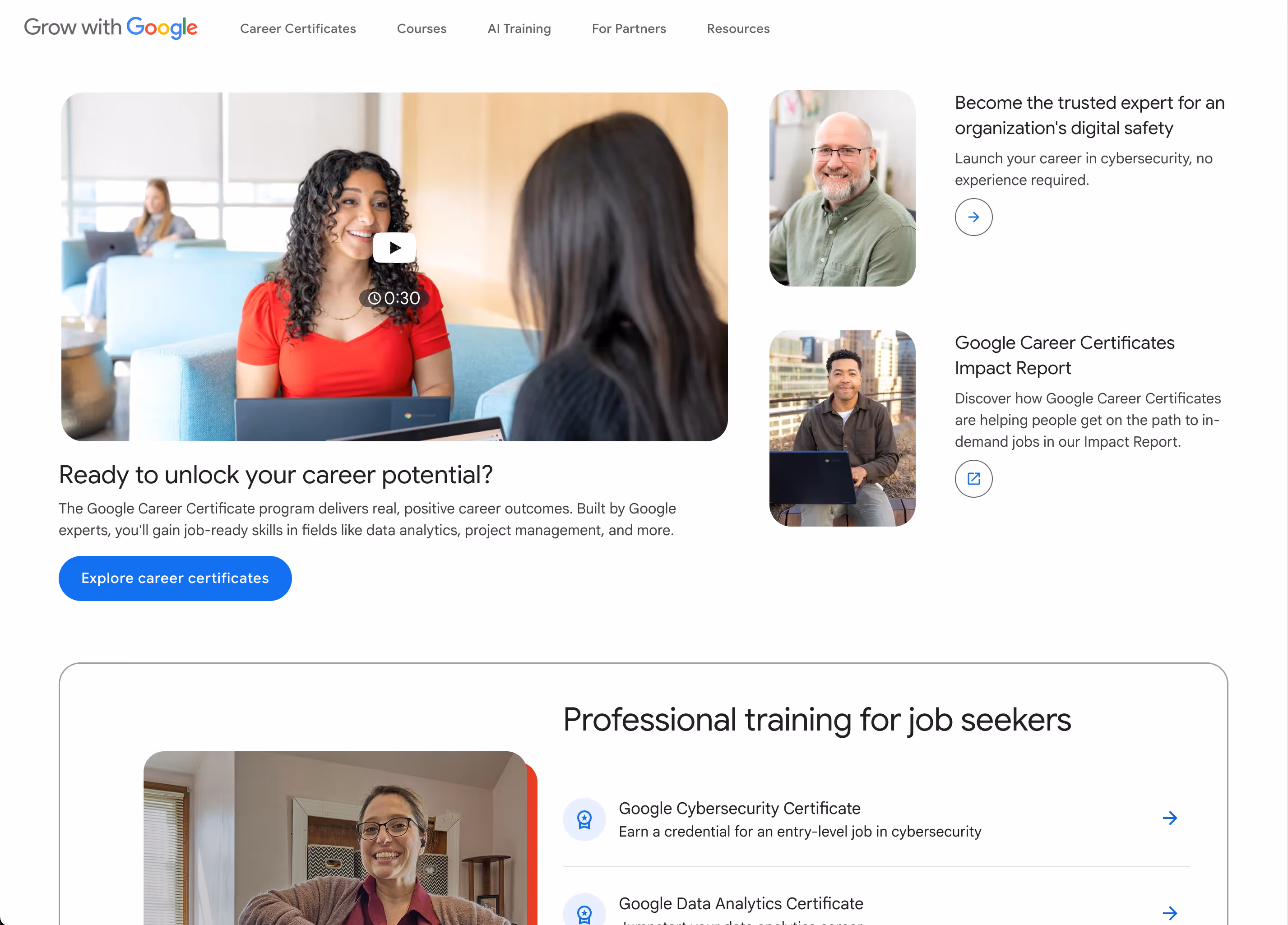
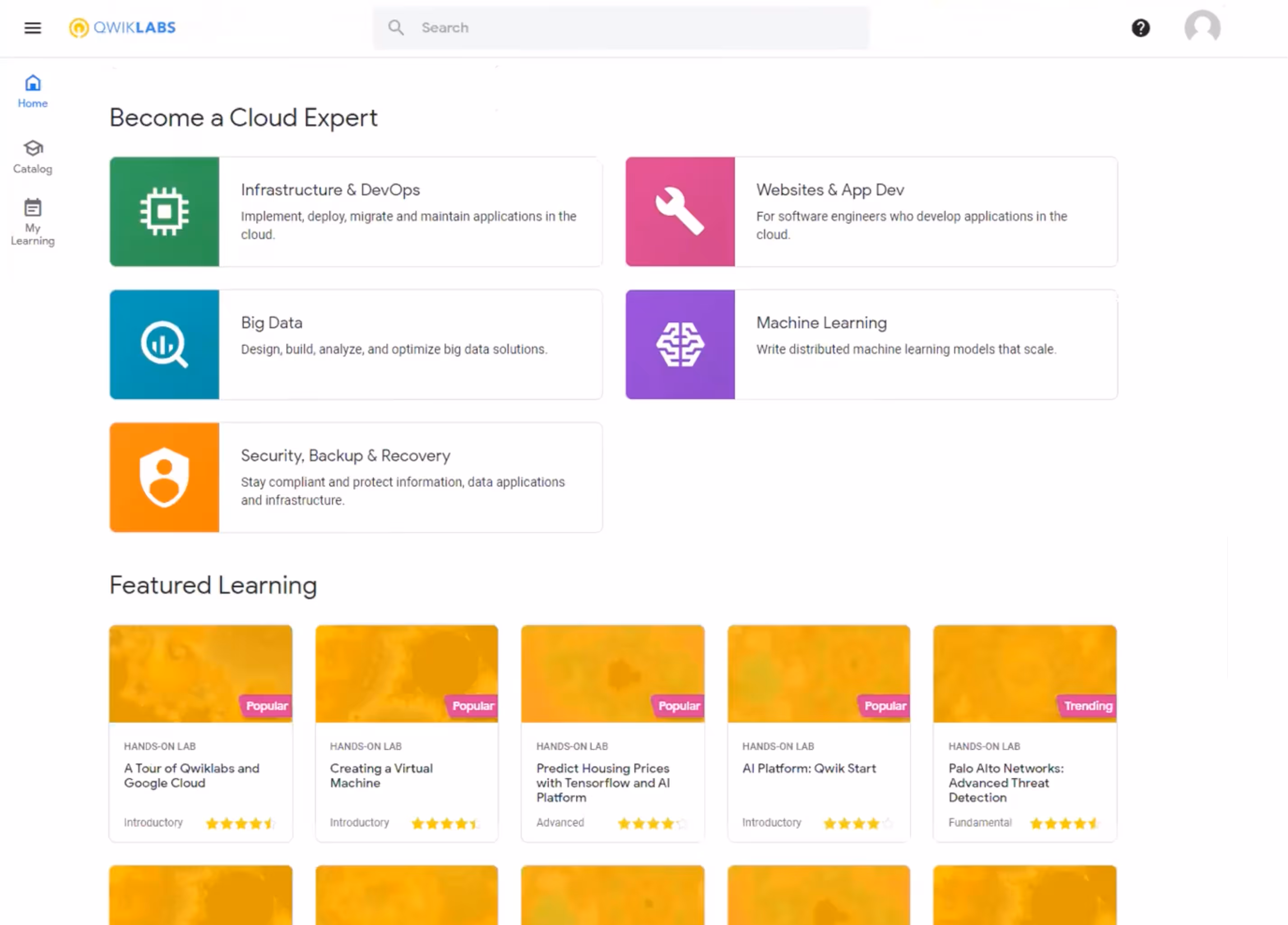
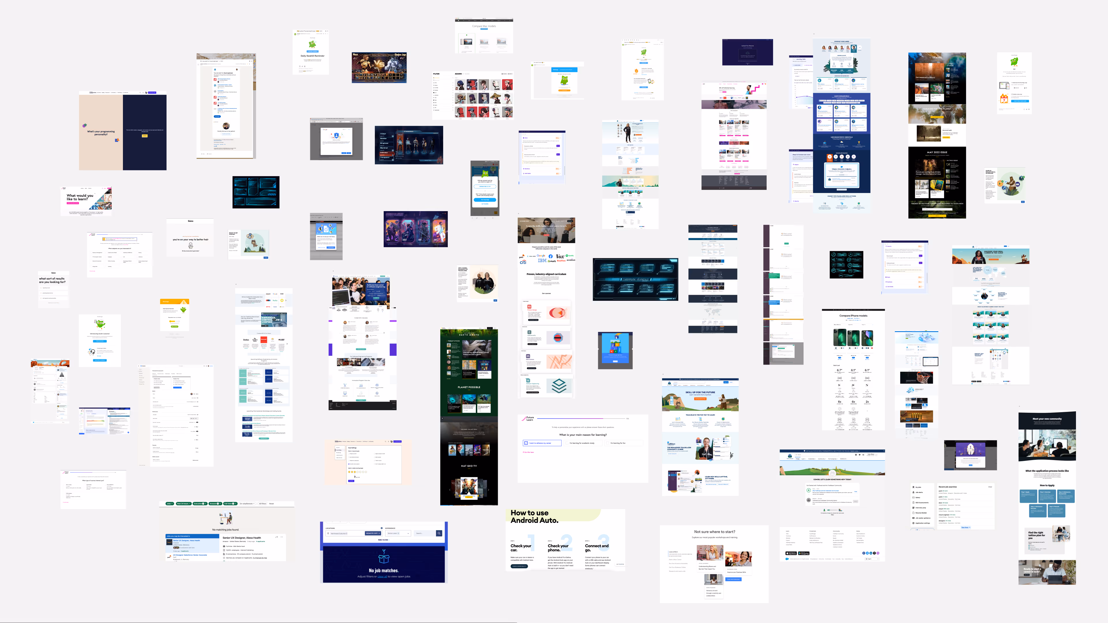
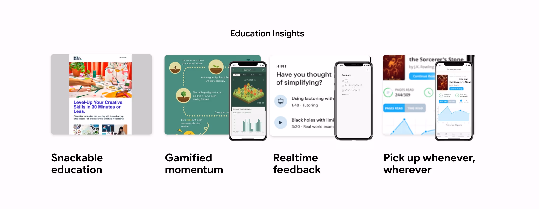
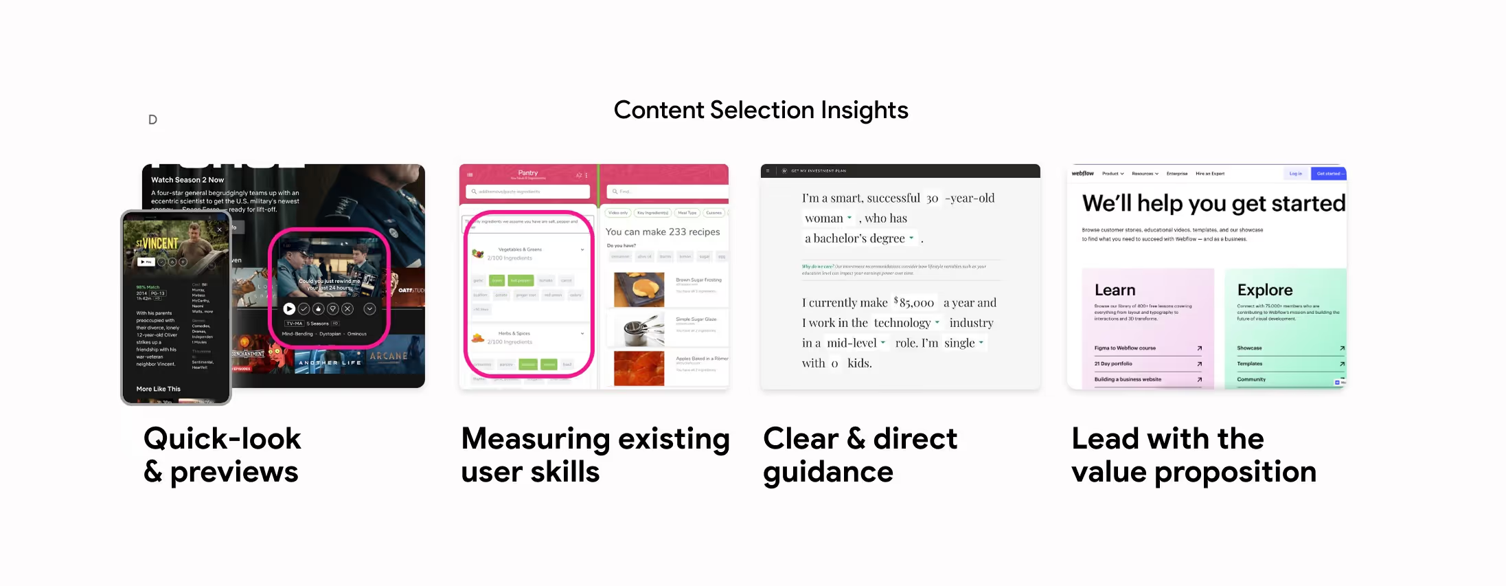
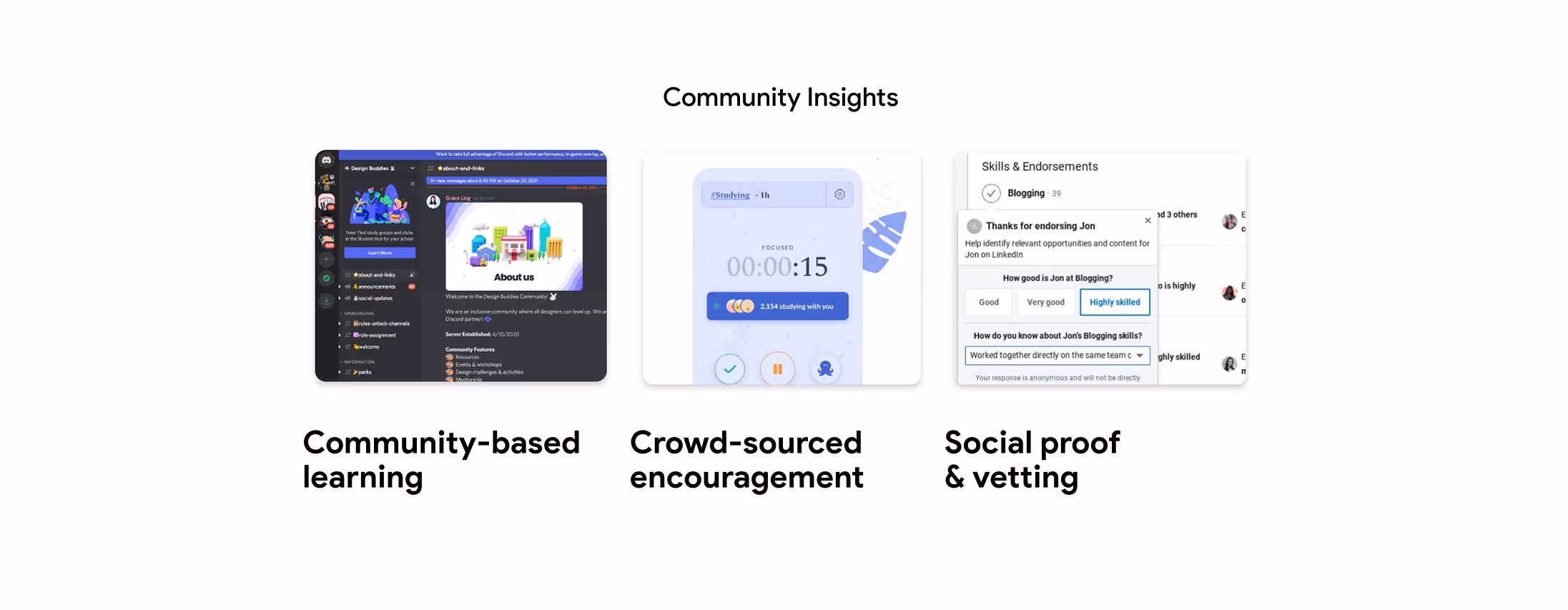
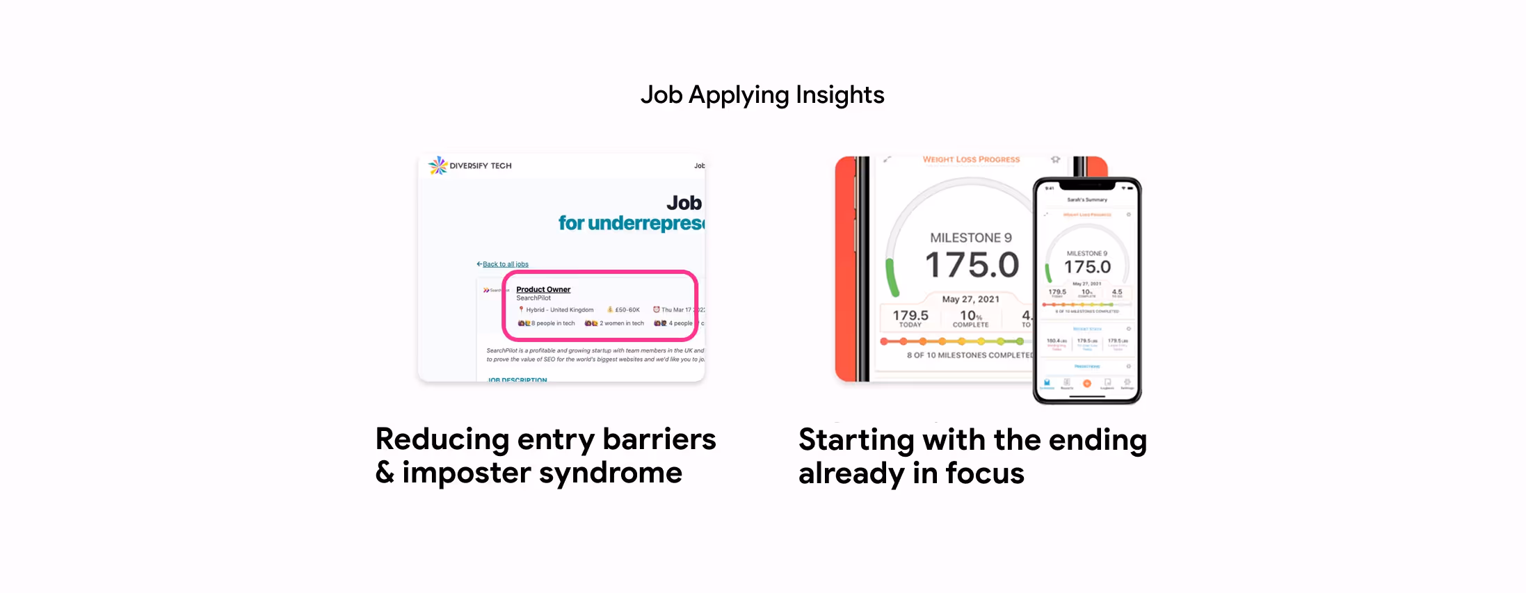
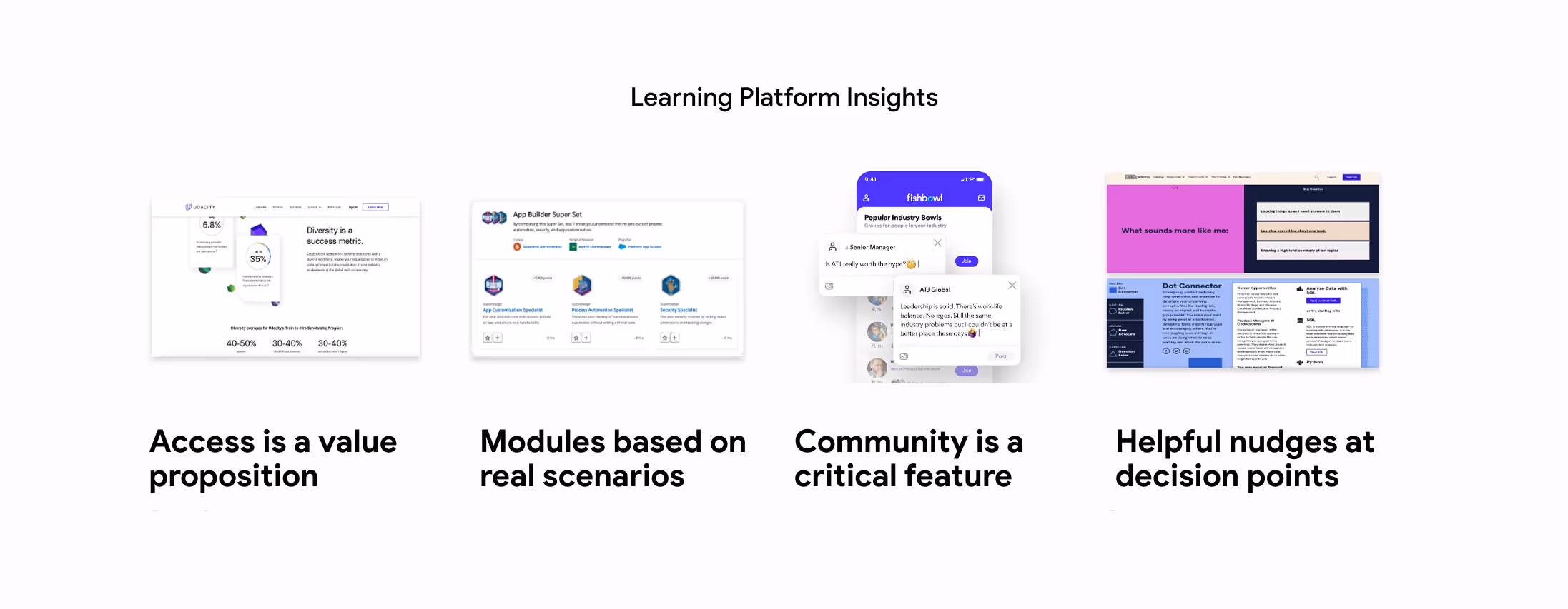
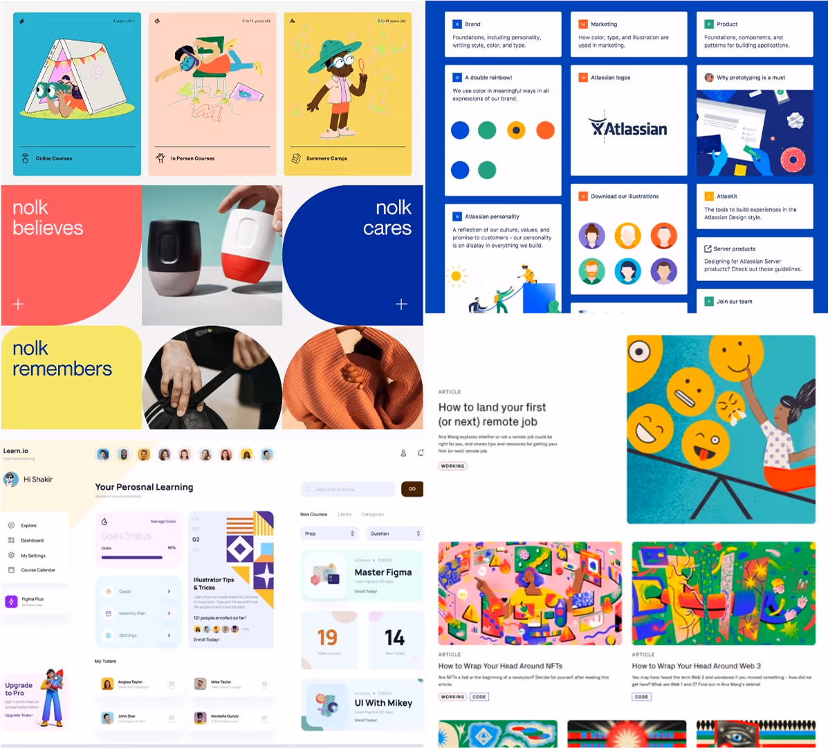
We analyzed 35+ platforms to observe best practices in areas like motivation, online learning, gamification, community, and career placement. This helped us anchor our work in both real user needs and the larger digital landscape. Our analysis inspired us to strive to deliver the following experience:
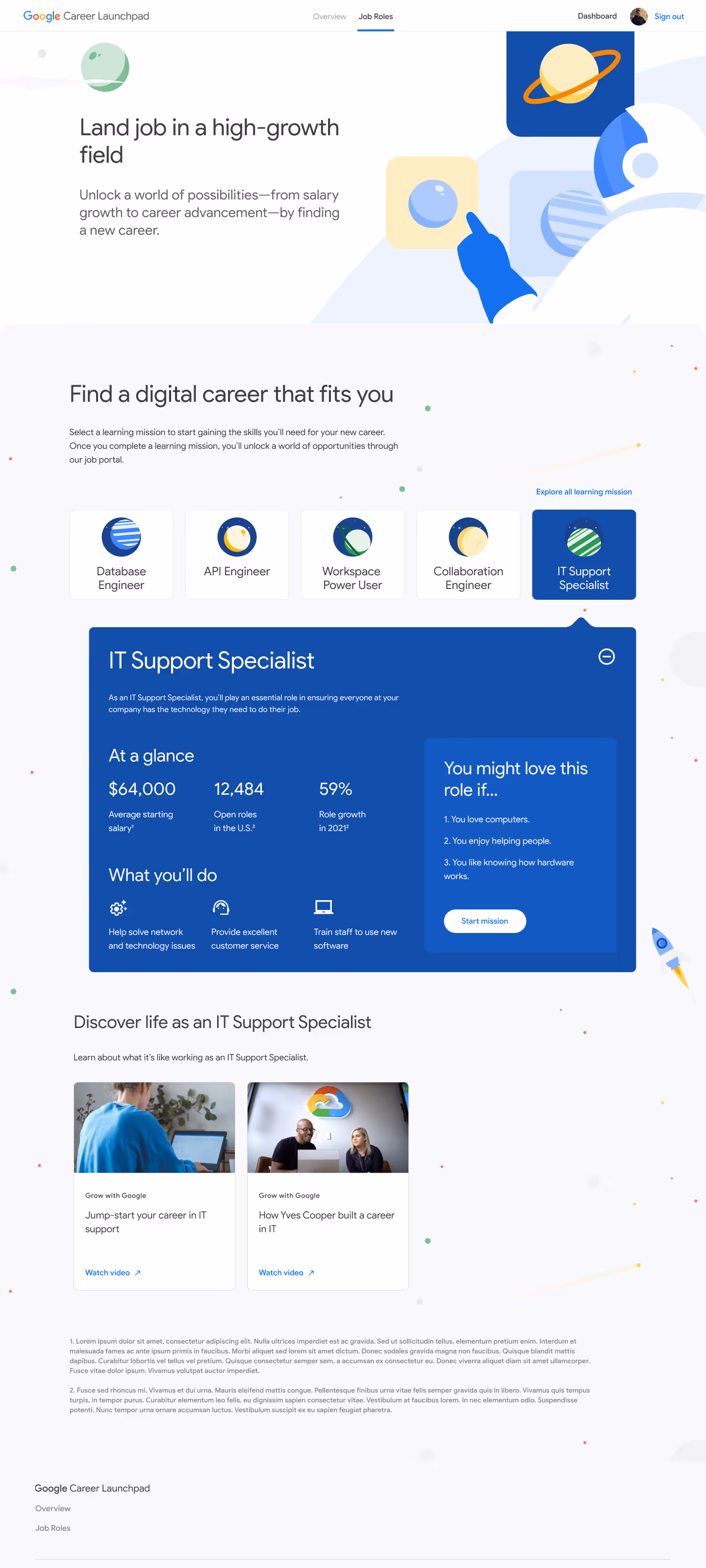
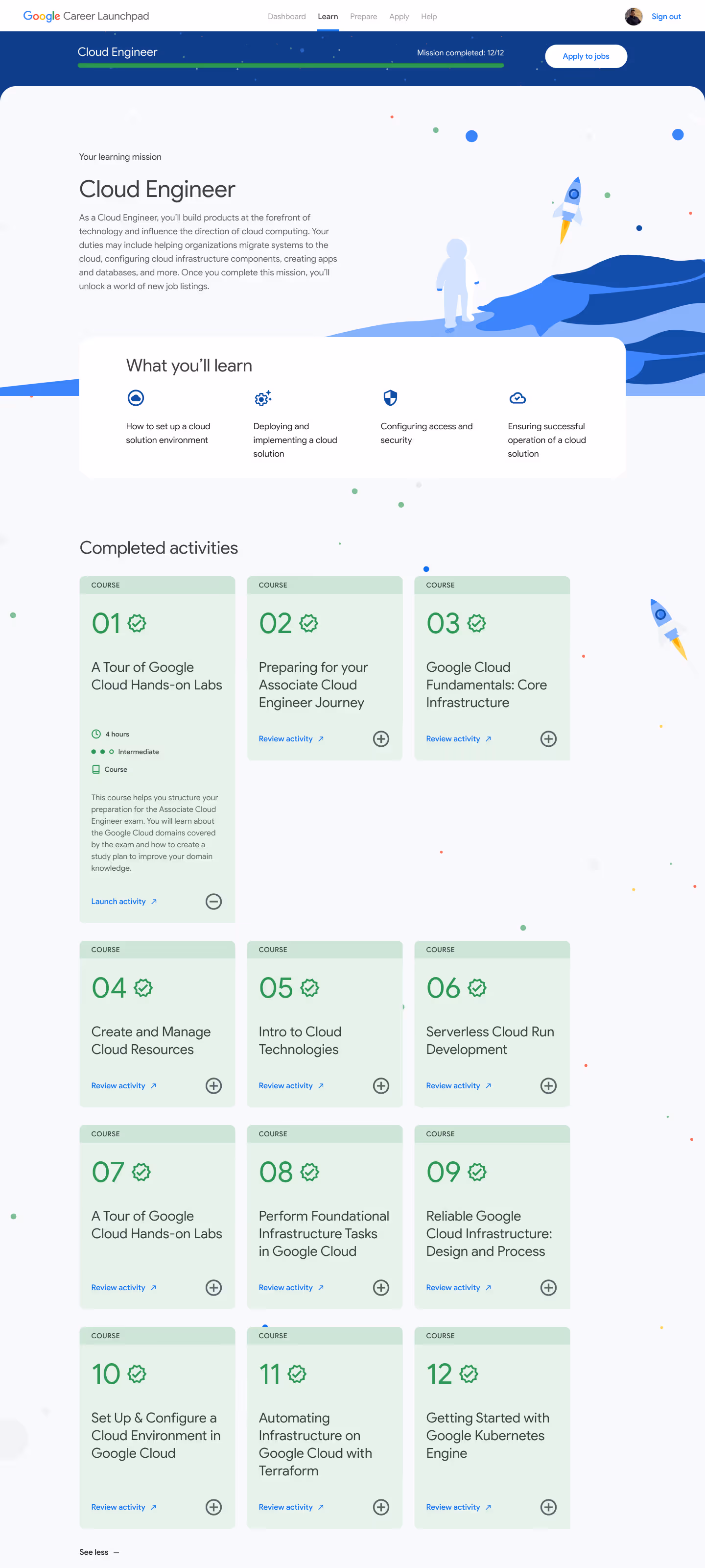
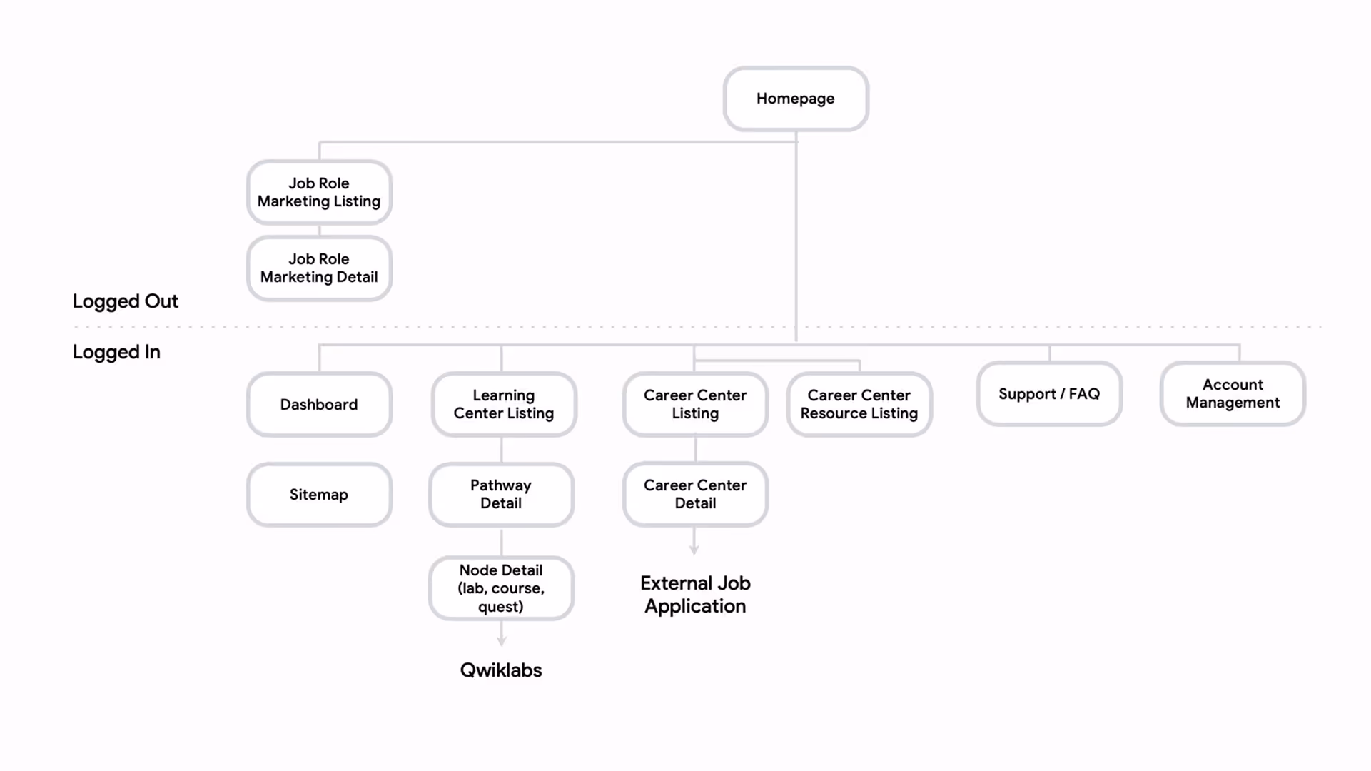
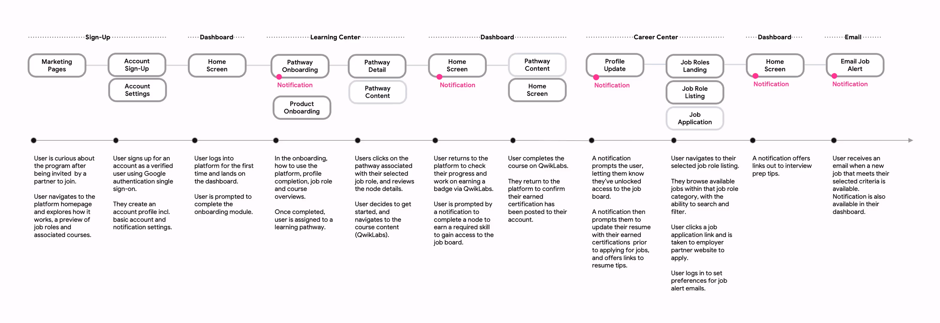
Keeping our user and ask requirements in mind, I mapped out a high-level site map as a starting point. I then teamed up with strategy to plot out the known Trainee user journey, from first login to job application. Key milestones included:
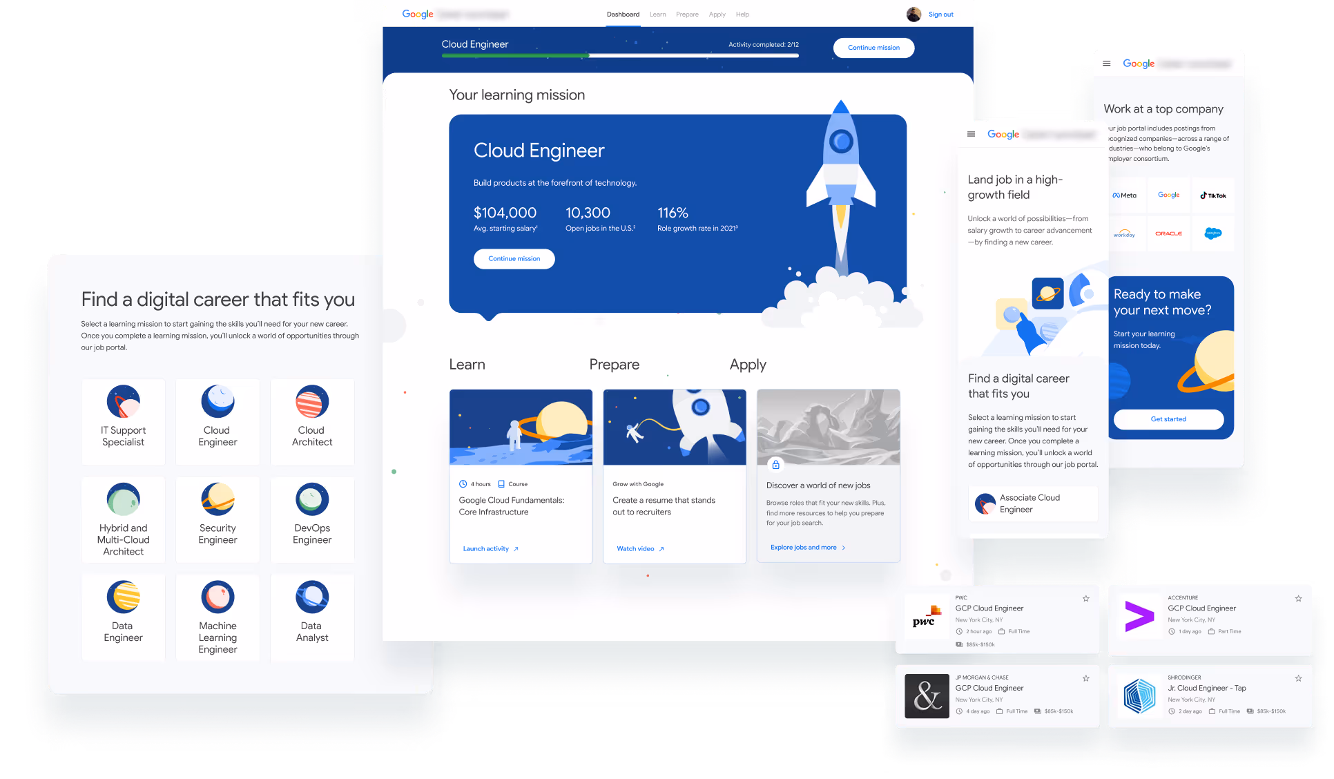
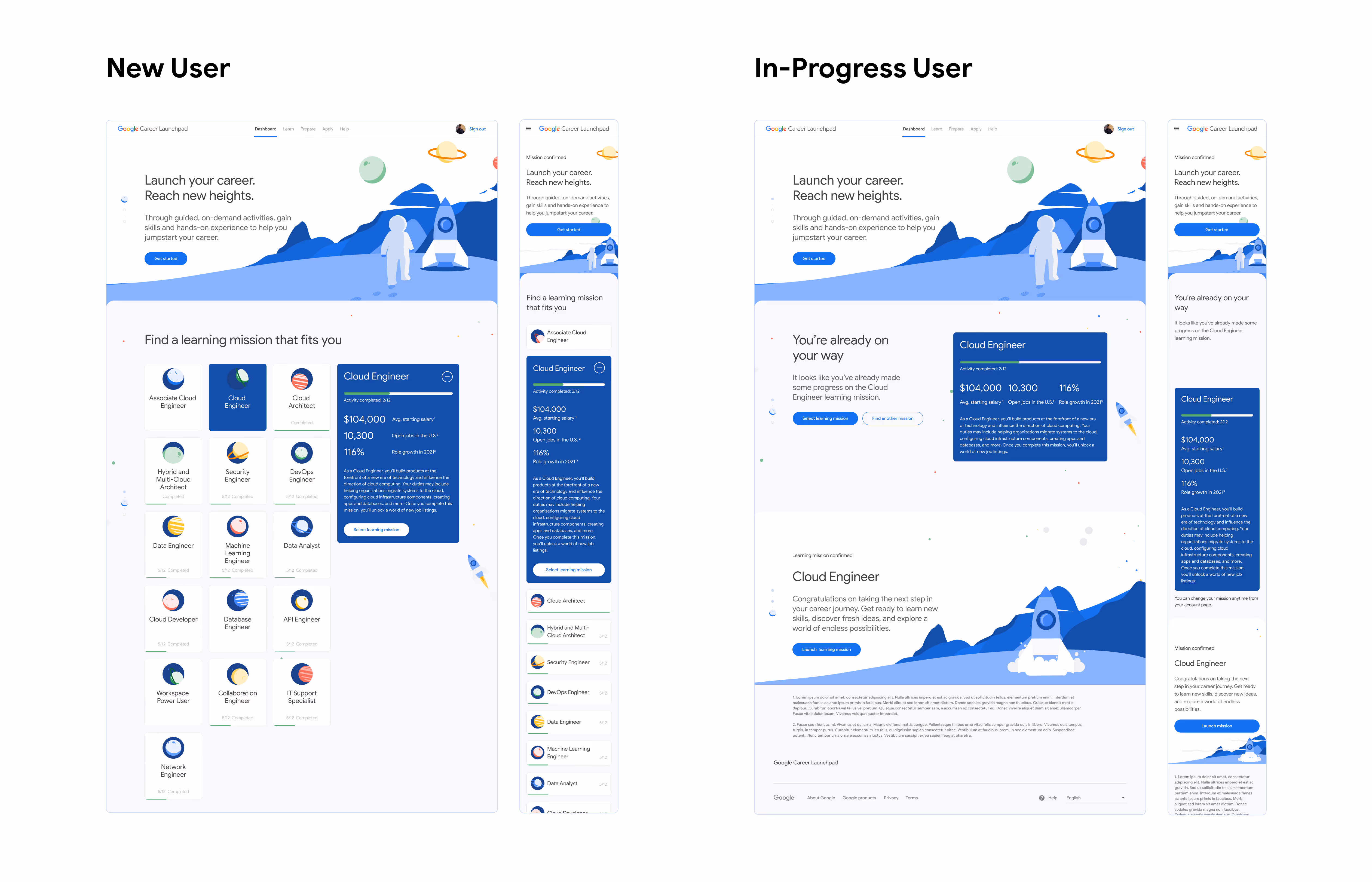
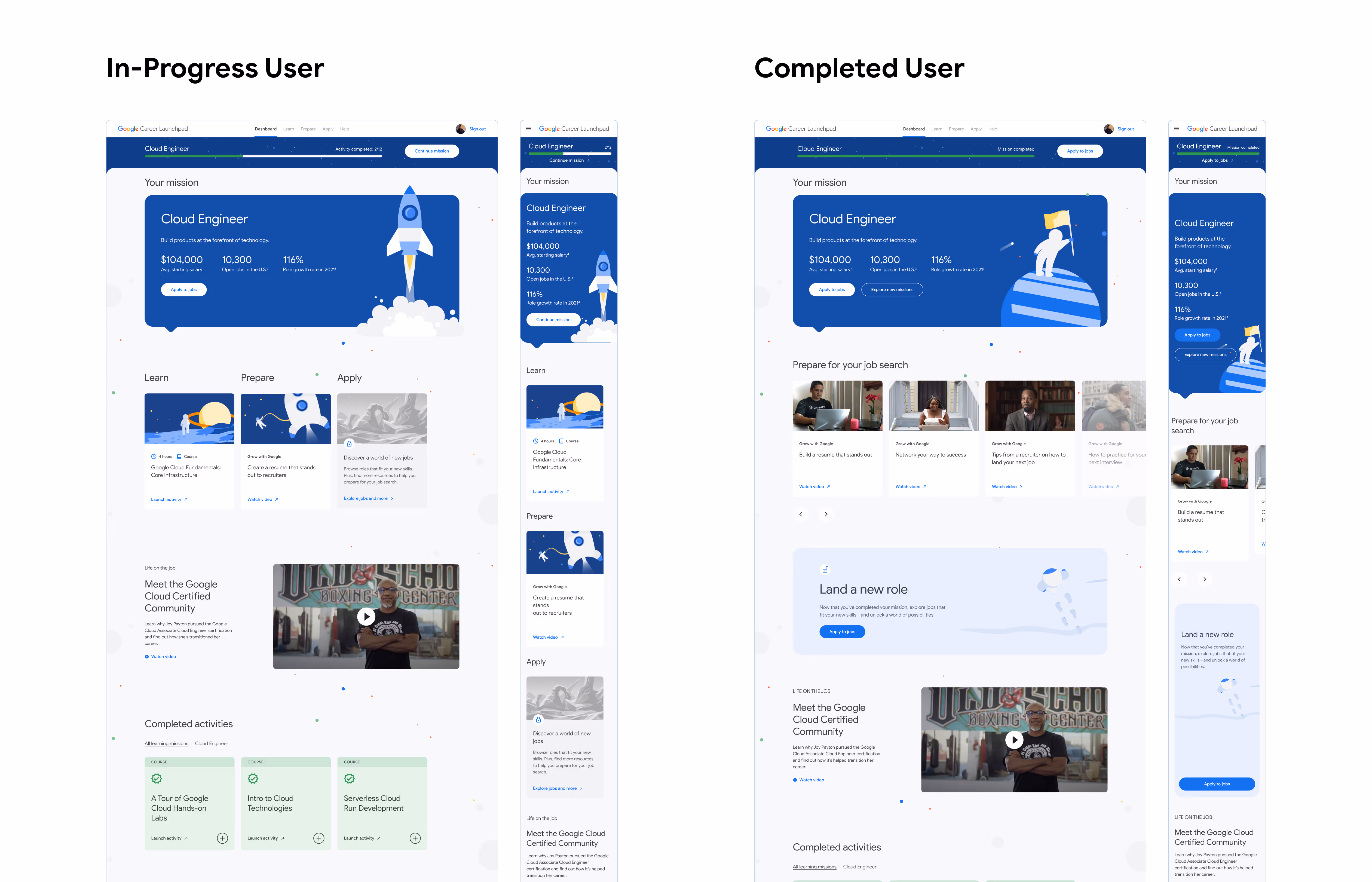
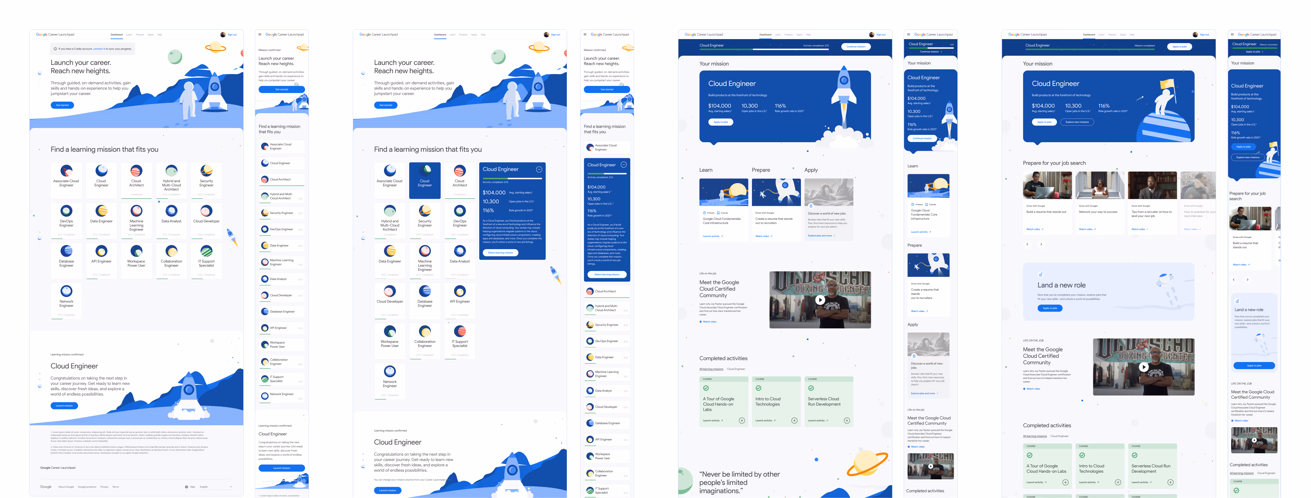
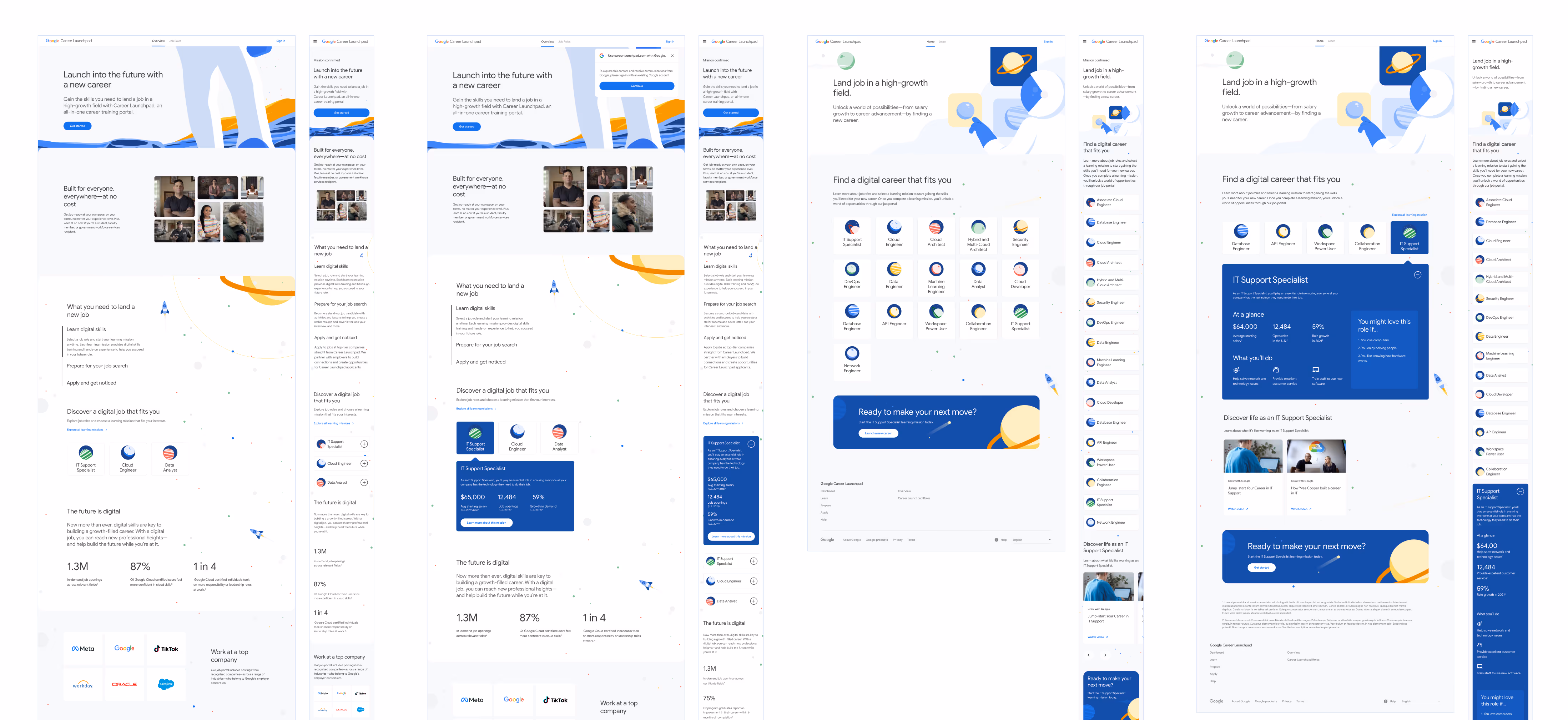
Our competitive analysis informed us that our platform should feel personal, easy to use, and even a little playful. I worked together with our creative director to explore creative concepts supported by starter badge designs by our visual designer. I built out mockup of the user dashboard page for client review, demonstrating the look and feel of two concepts:
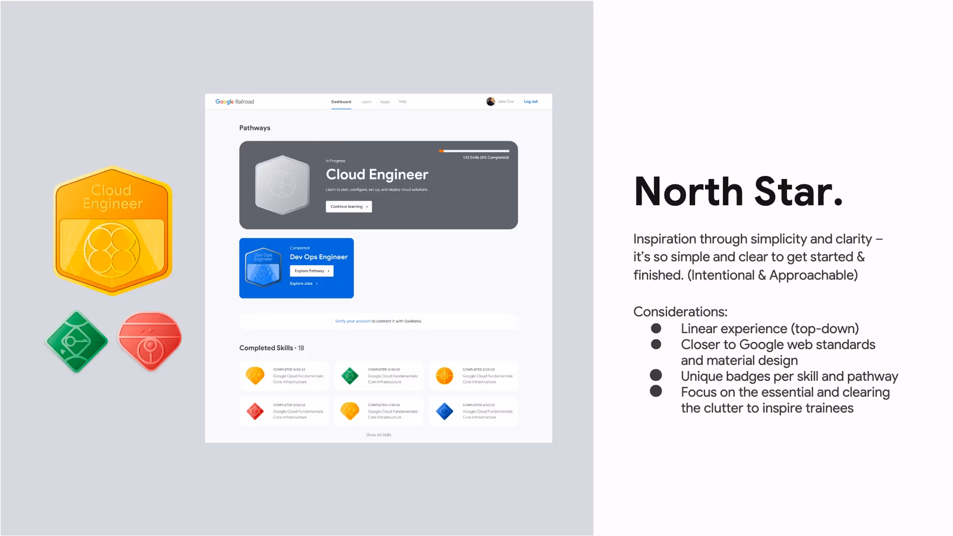

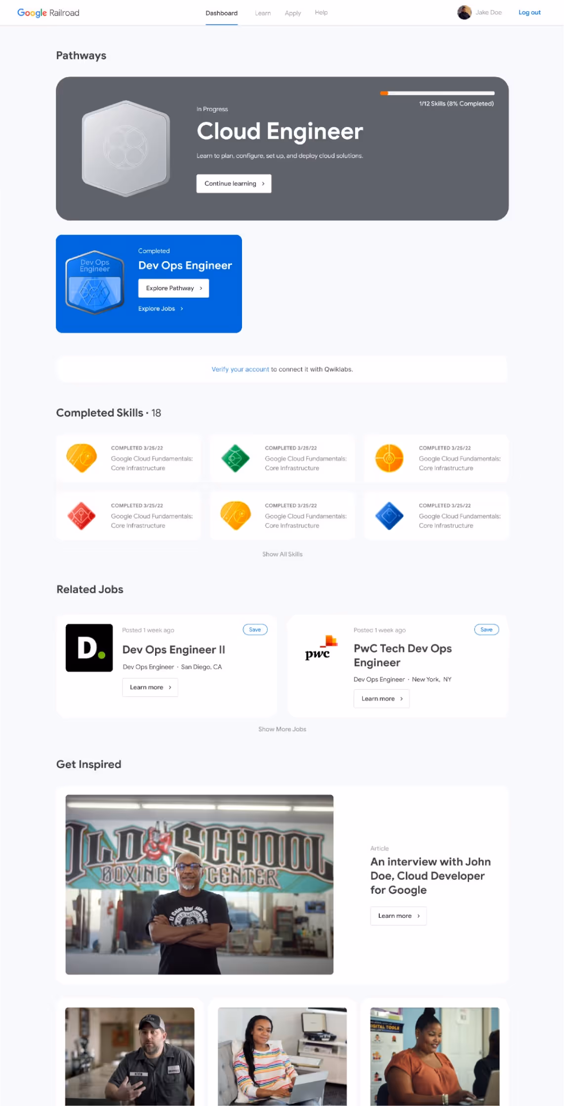
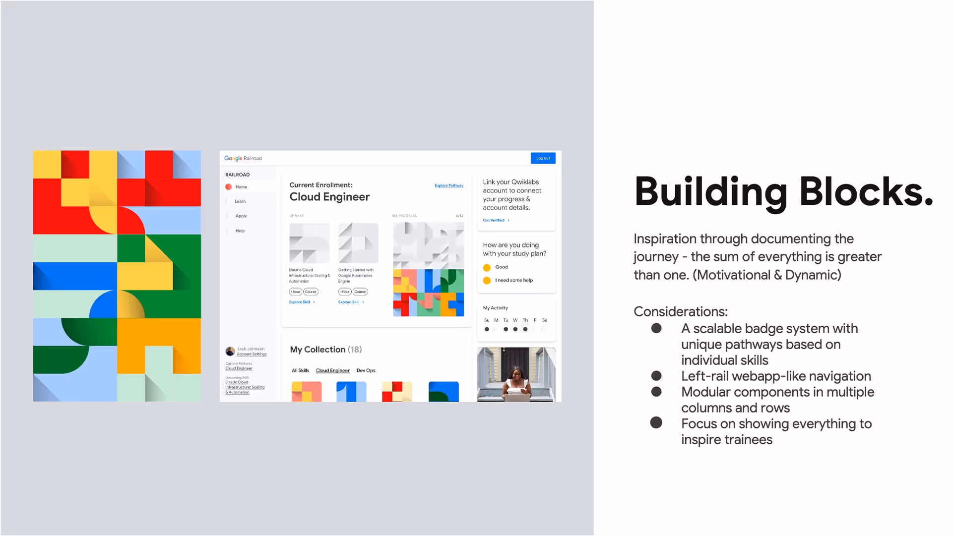
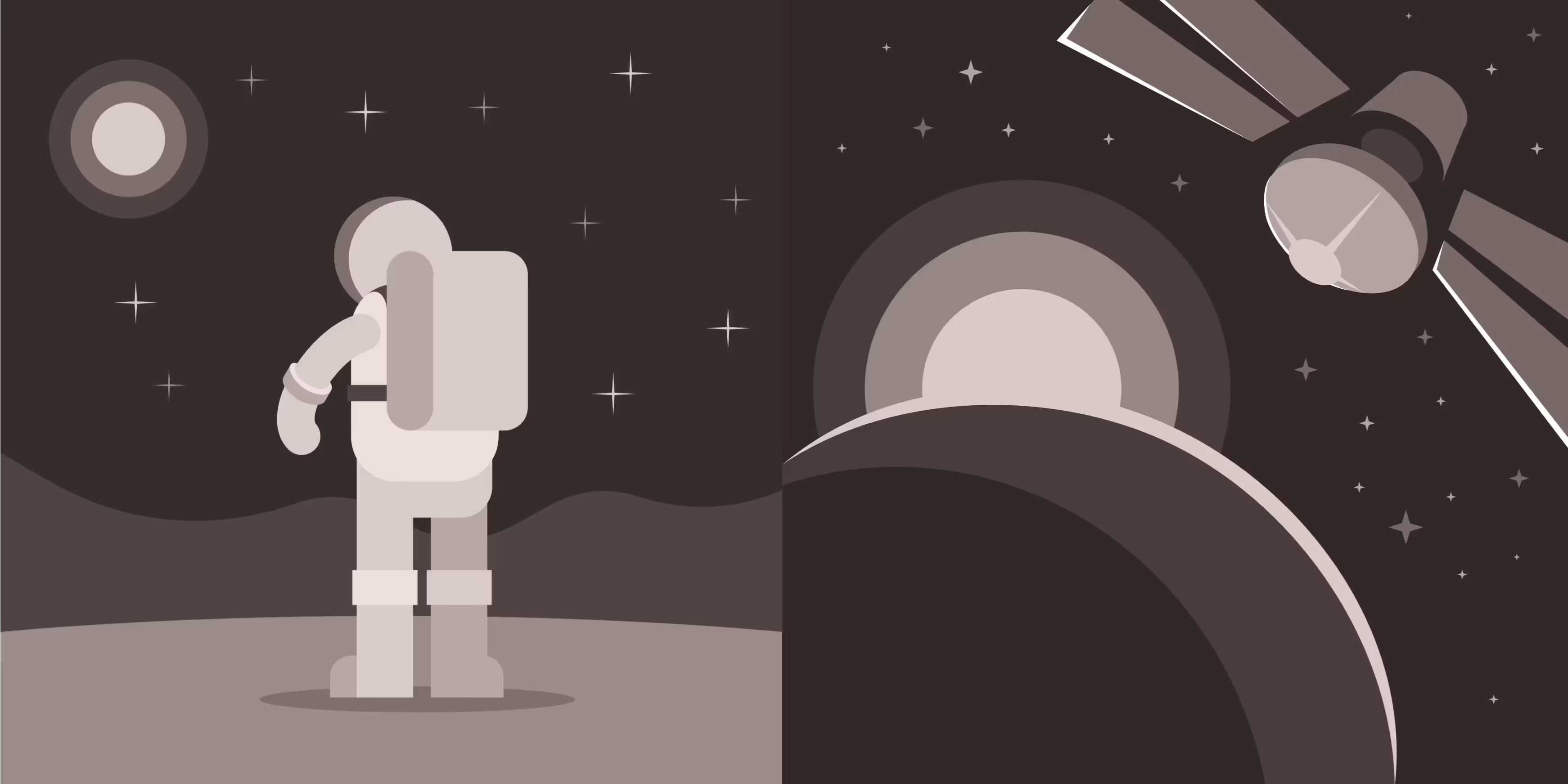
The North Star concept was more practical for the platform, but the Google team found it too austere and boring. Ongoing feedback shifted us away from the complex building blocks badge systems and towards a playful, yet sophisticated space mission-inspired theme. This new direction featured badges, icons, and illustrations rooted in space exploration, while leaning into the North Star concept and Google’s signature brand colors.
Terminology changes included:
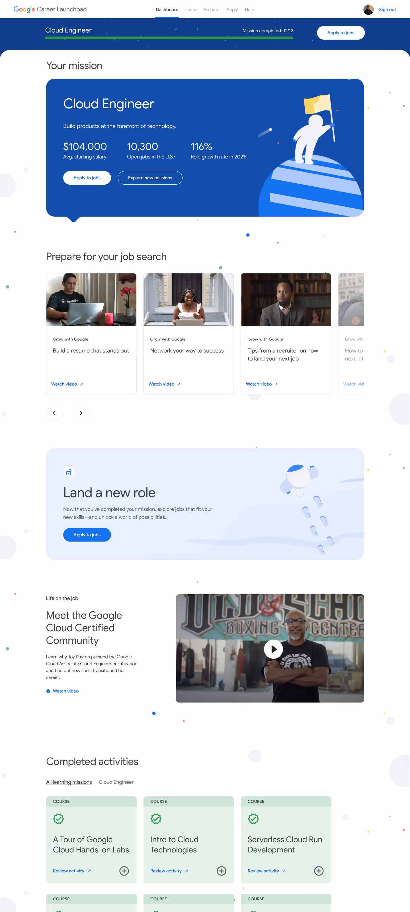
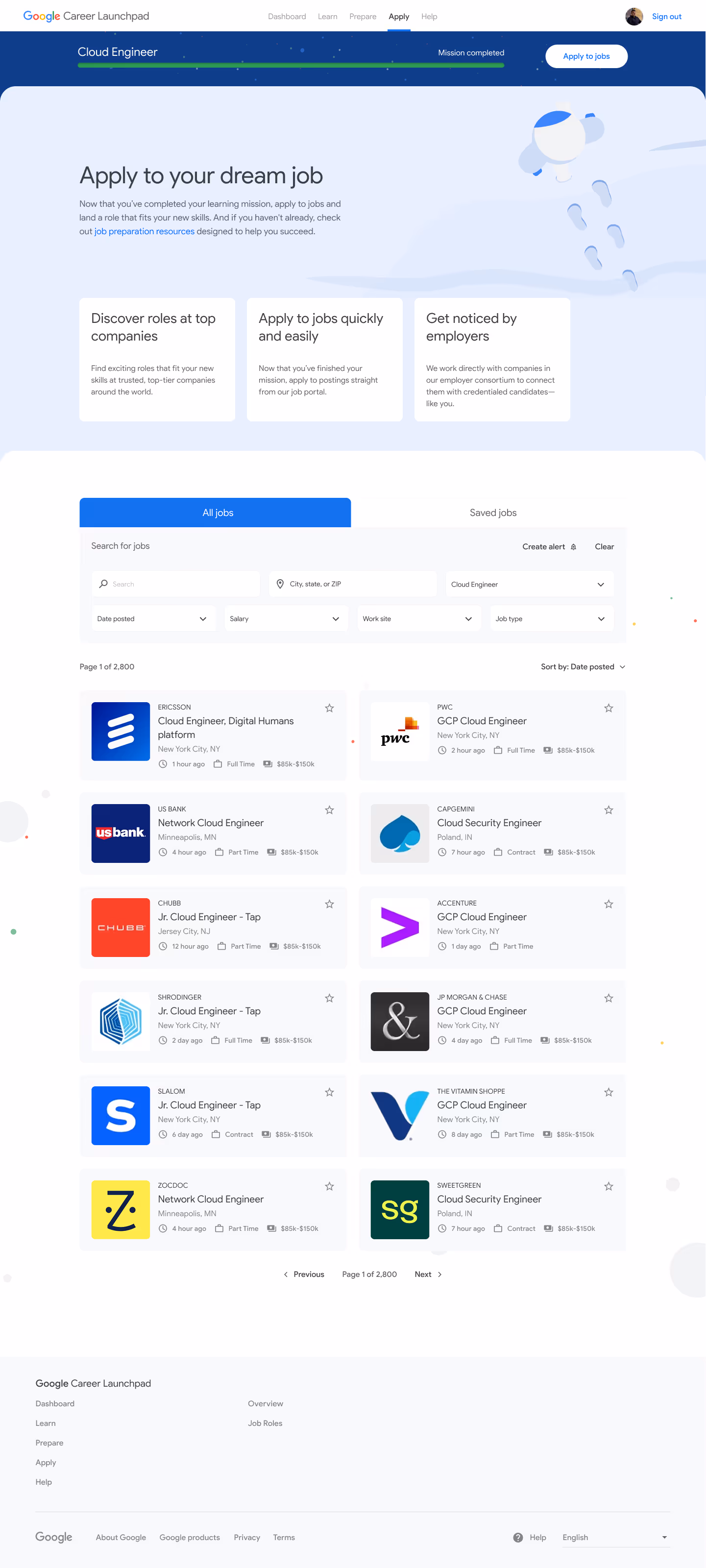
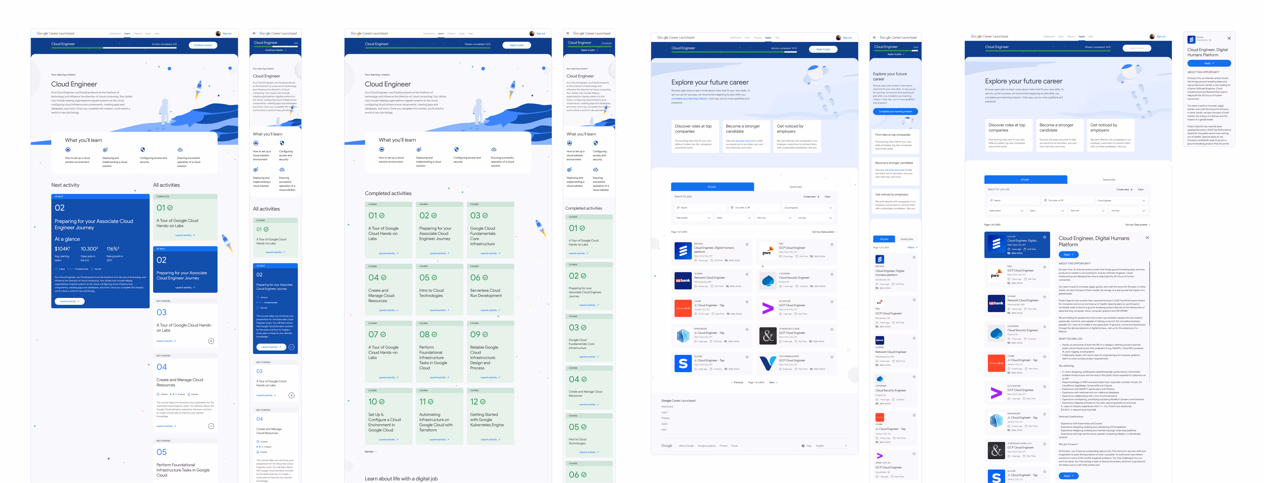
While strategizing on how to keep learners progressing through their learning pathways, our team decided to utilize the job search page as a source of motivation. We divided the job applying experience into two parts:
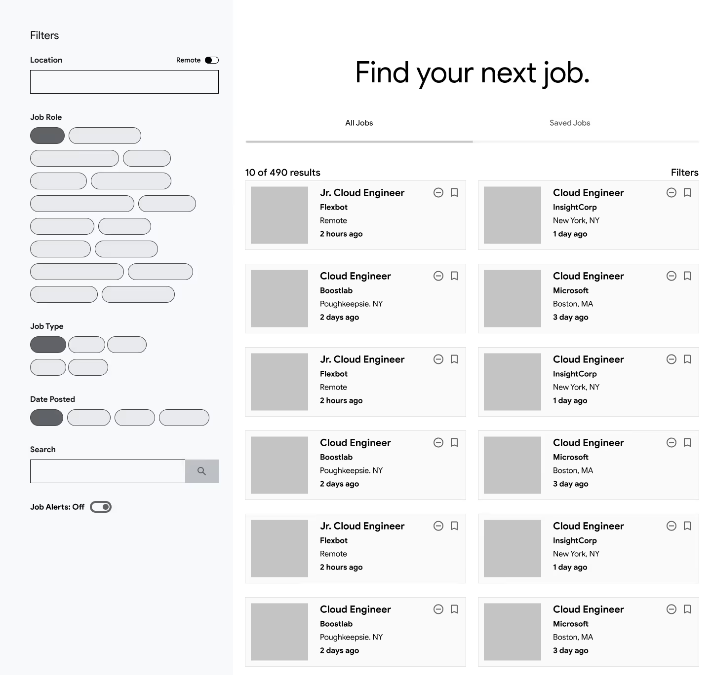
Access to these two pages would depend on the user's learning status:

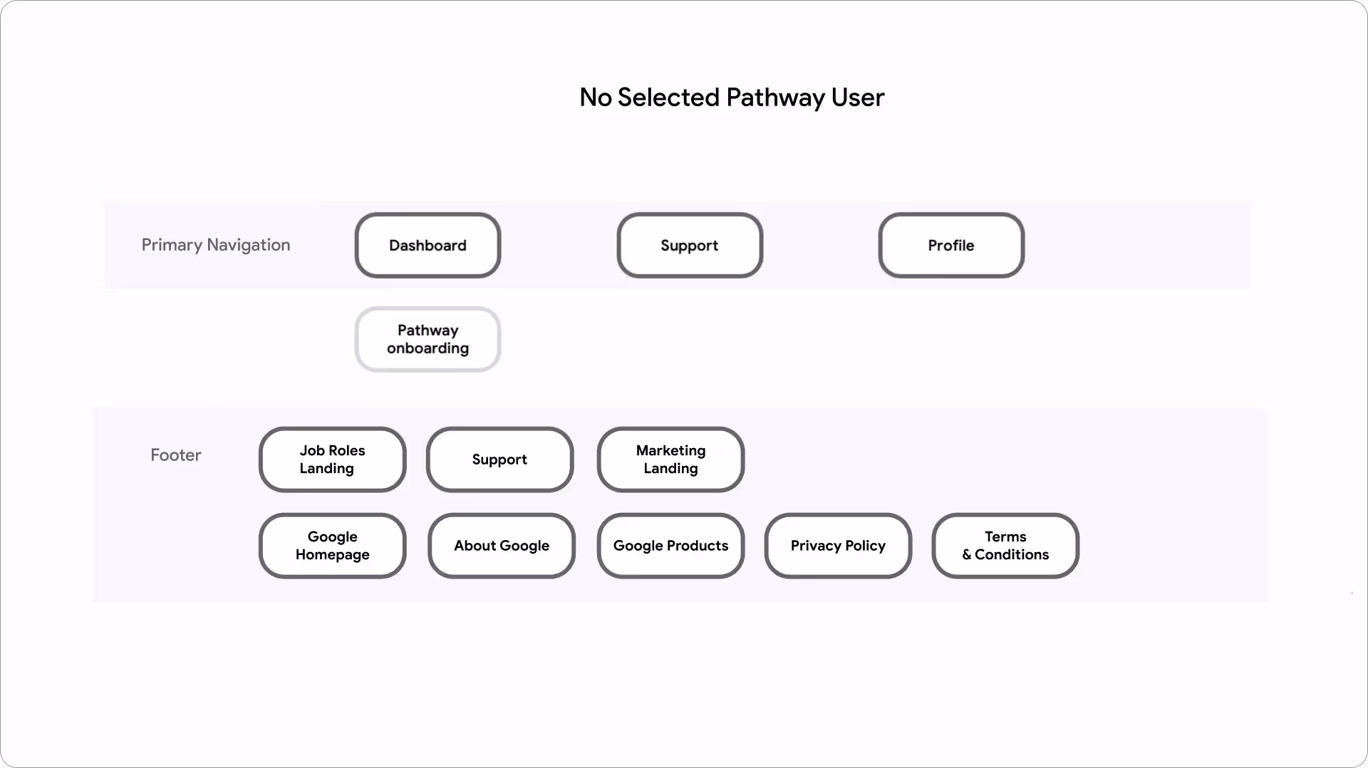
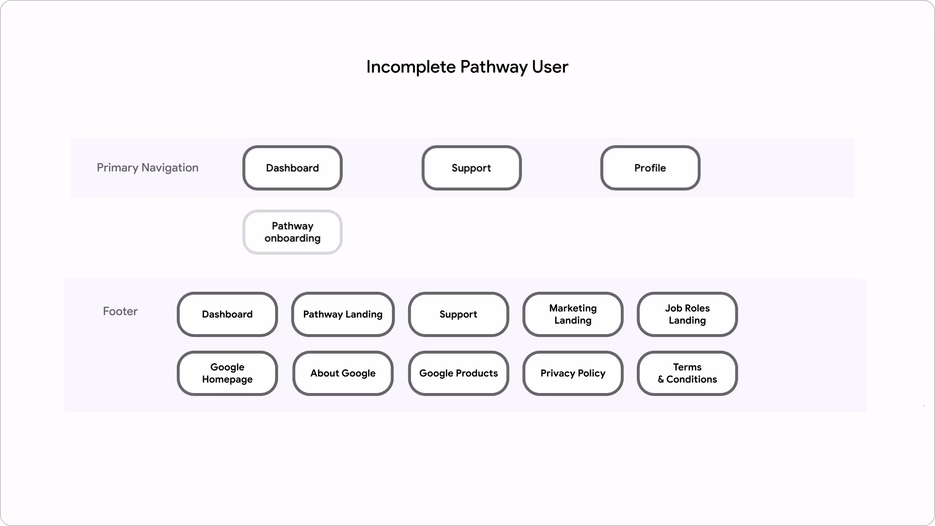

As part of forming our IA, I worked closely with strategy and copywriting on building our content approach and performing content blocking for each page within the platform. In addition to learner needs, we made our decisions based on scalability of content and ease-of-use for Google's internal content practitioners.
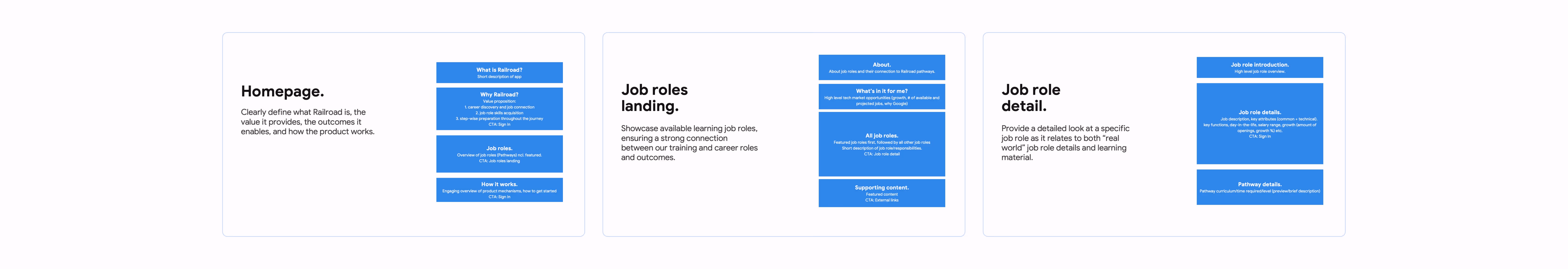
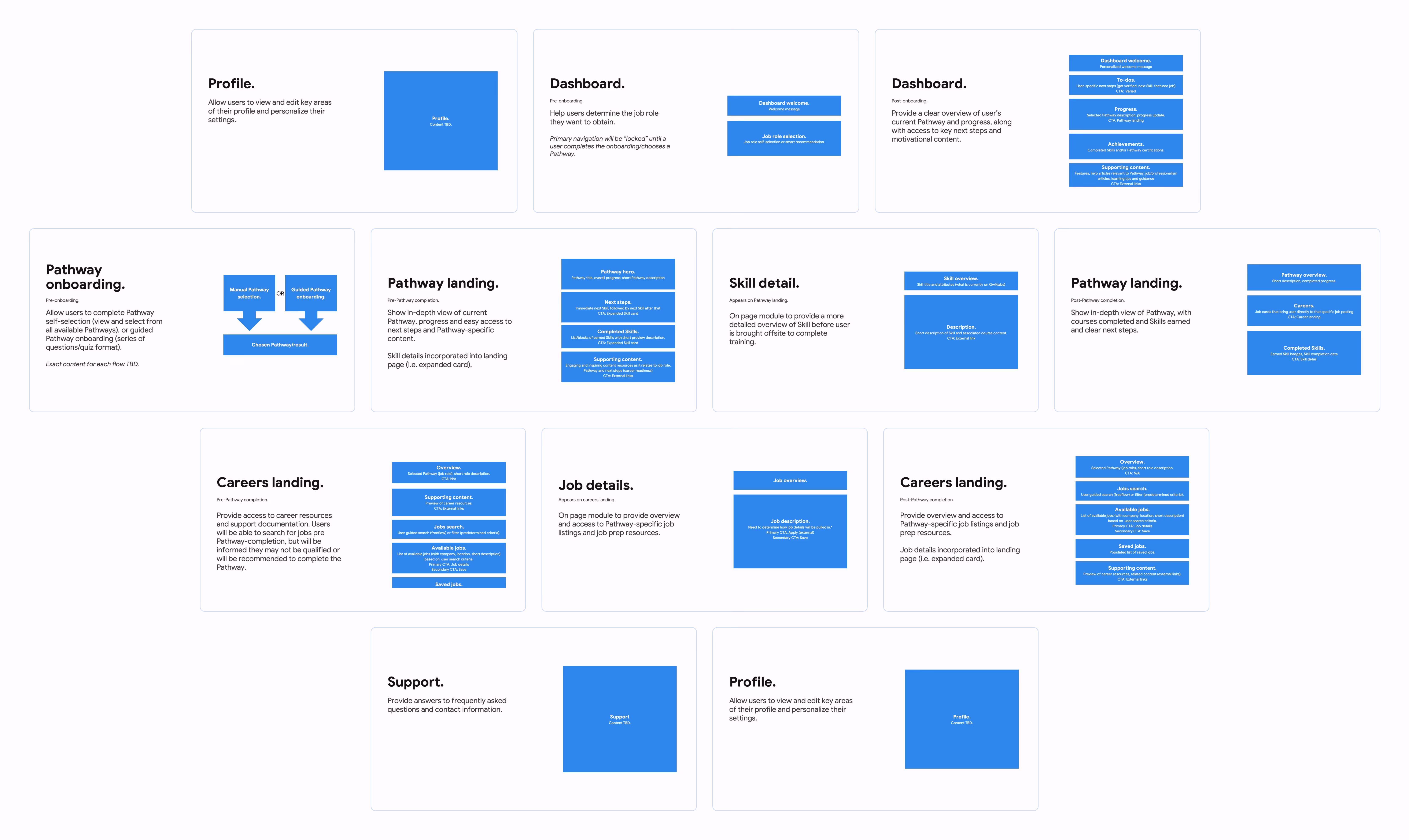
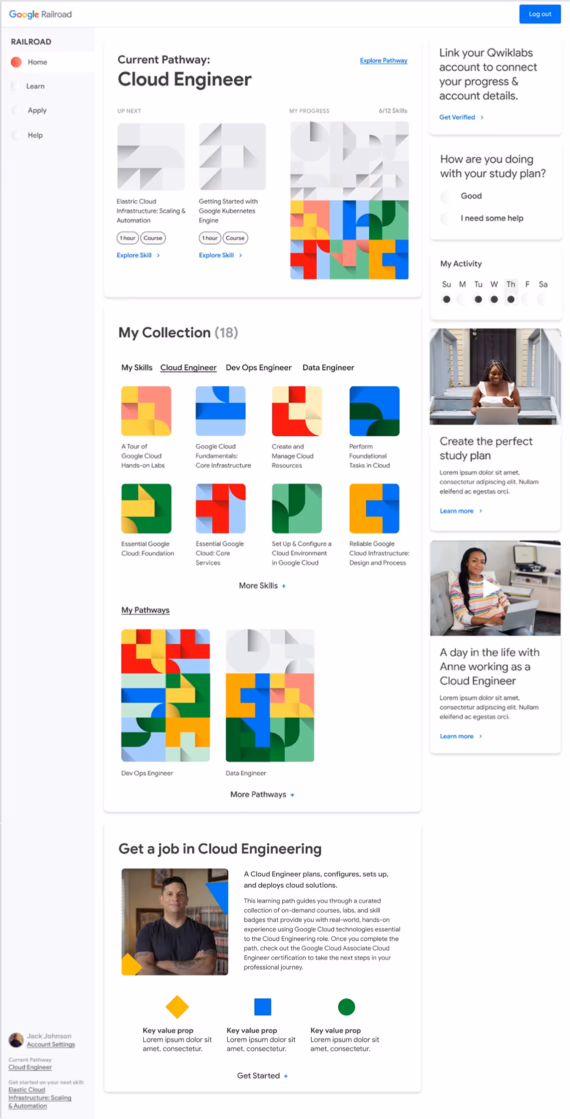
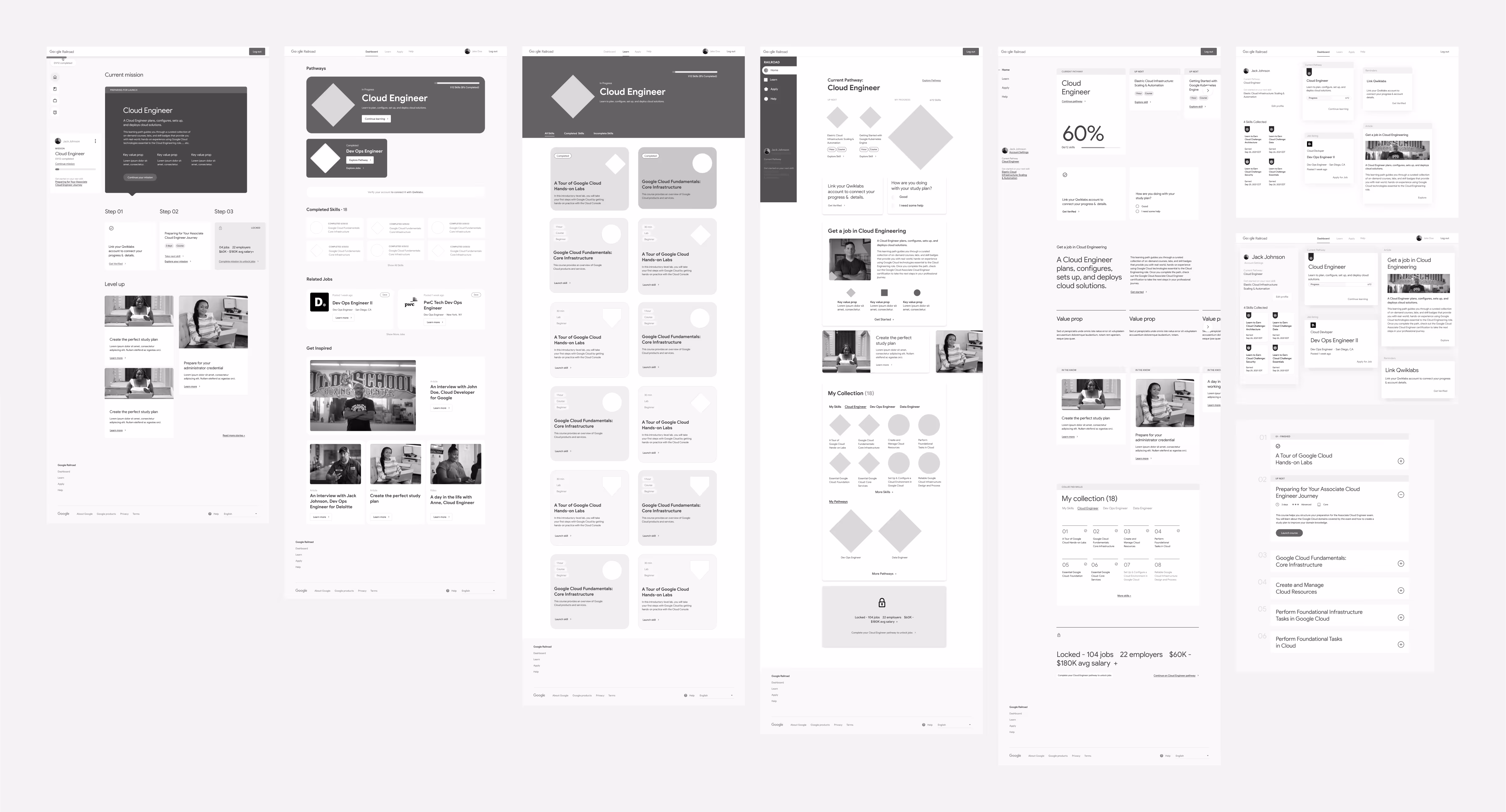
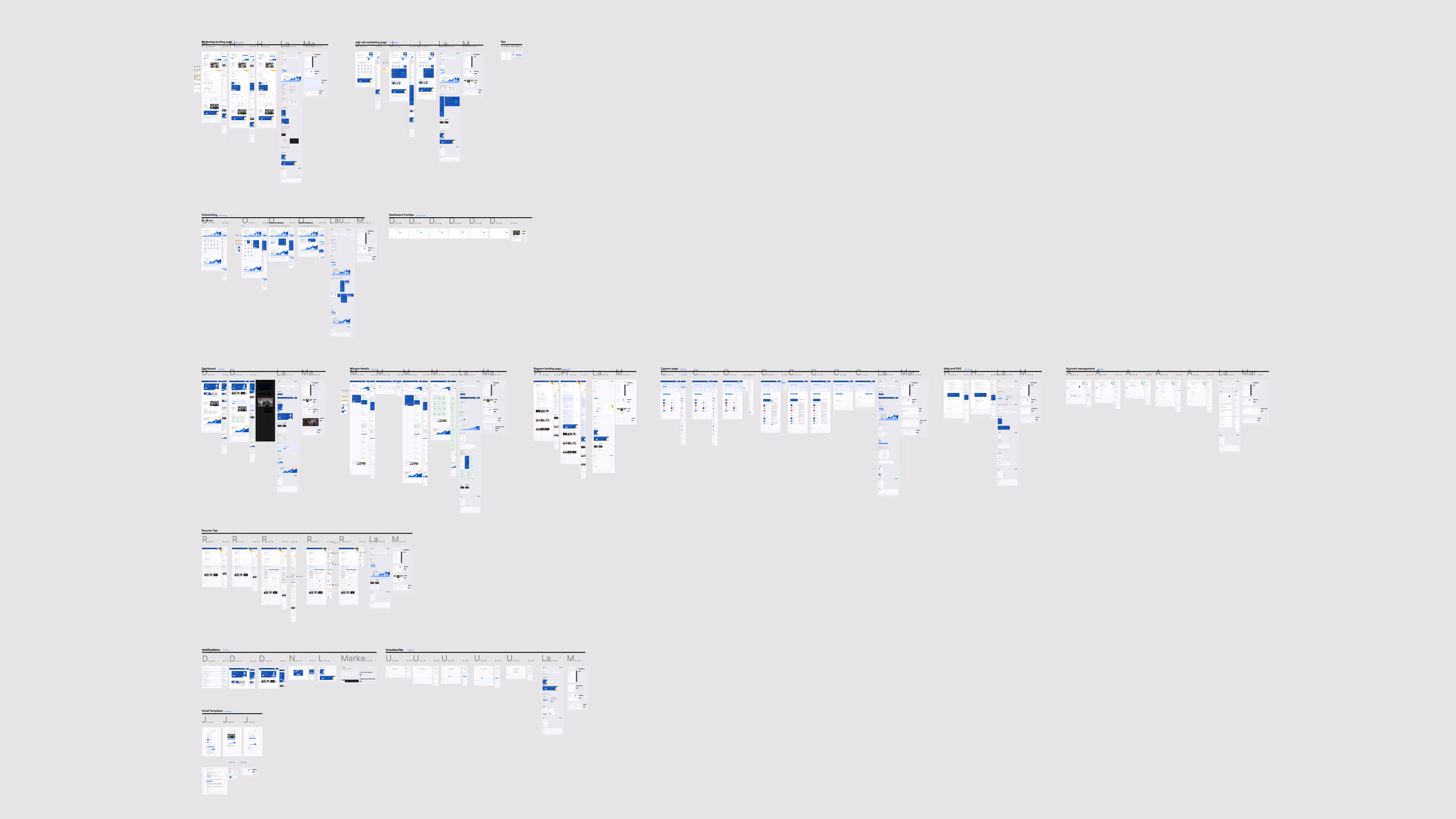
In our first sprint, I delivered full mockups and prototypes of core product screens including mission (pathway) selection, user dashboard, mission details, and careers search. Encompassing the central experience of the platform, these screens were crucial to nailing down the product vision that the Google team was looking for.


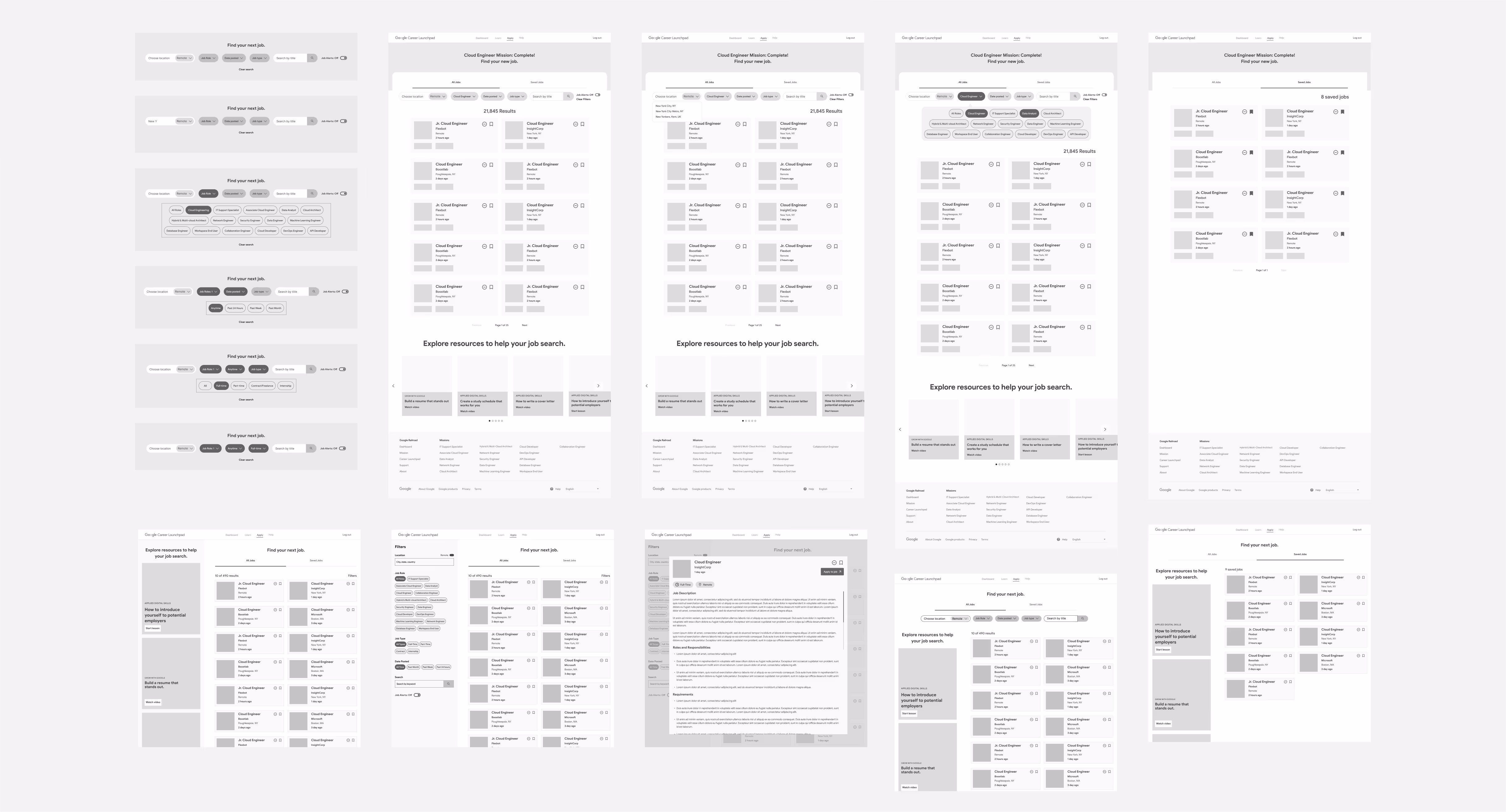
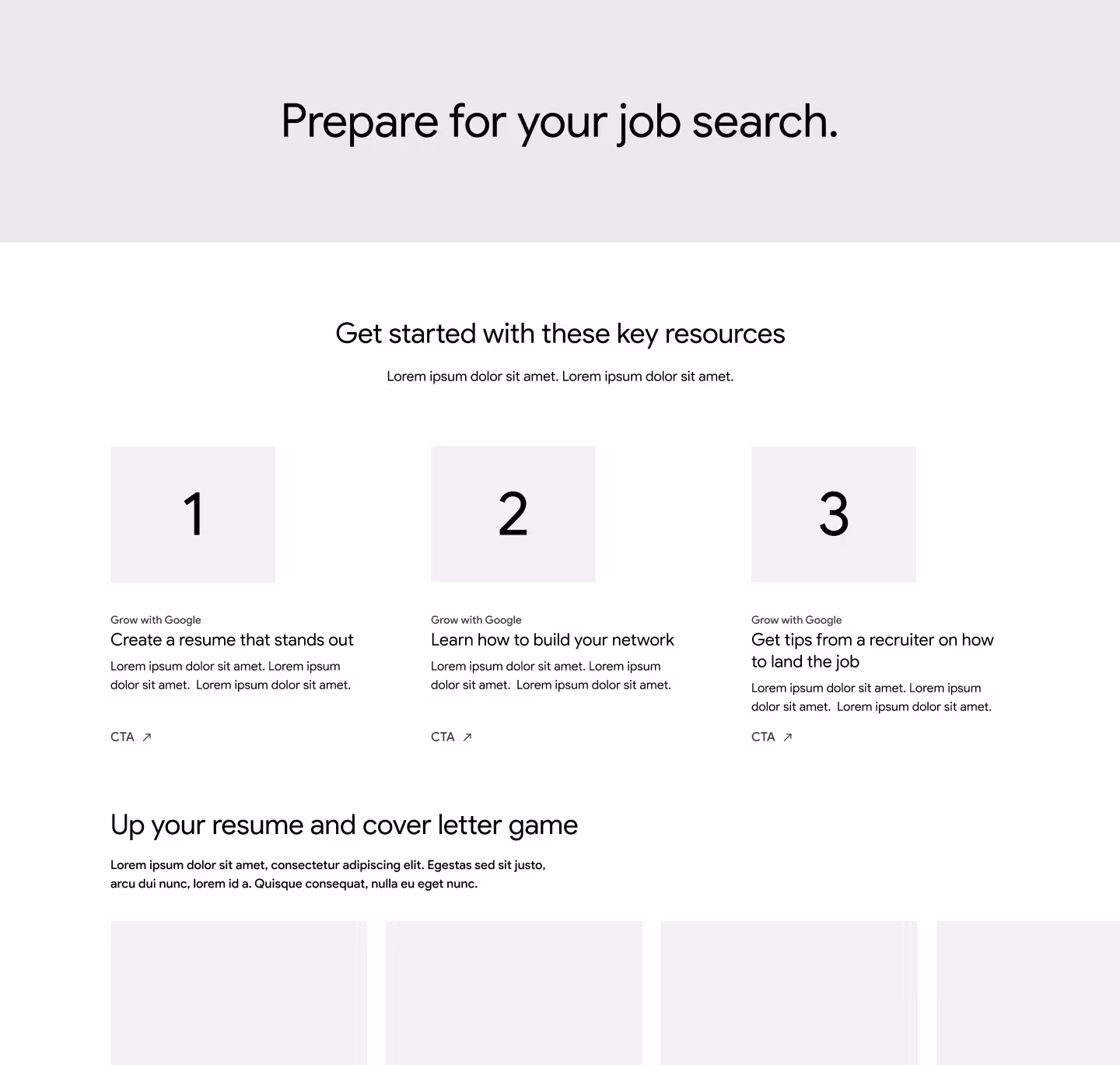
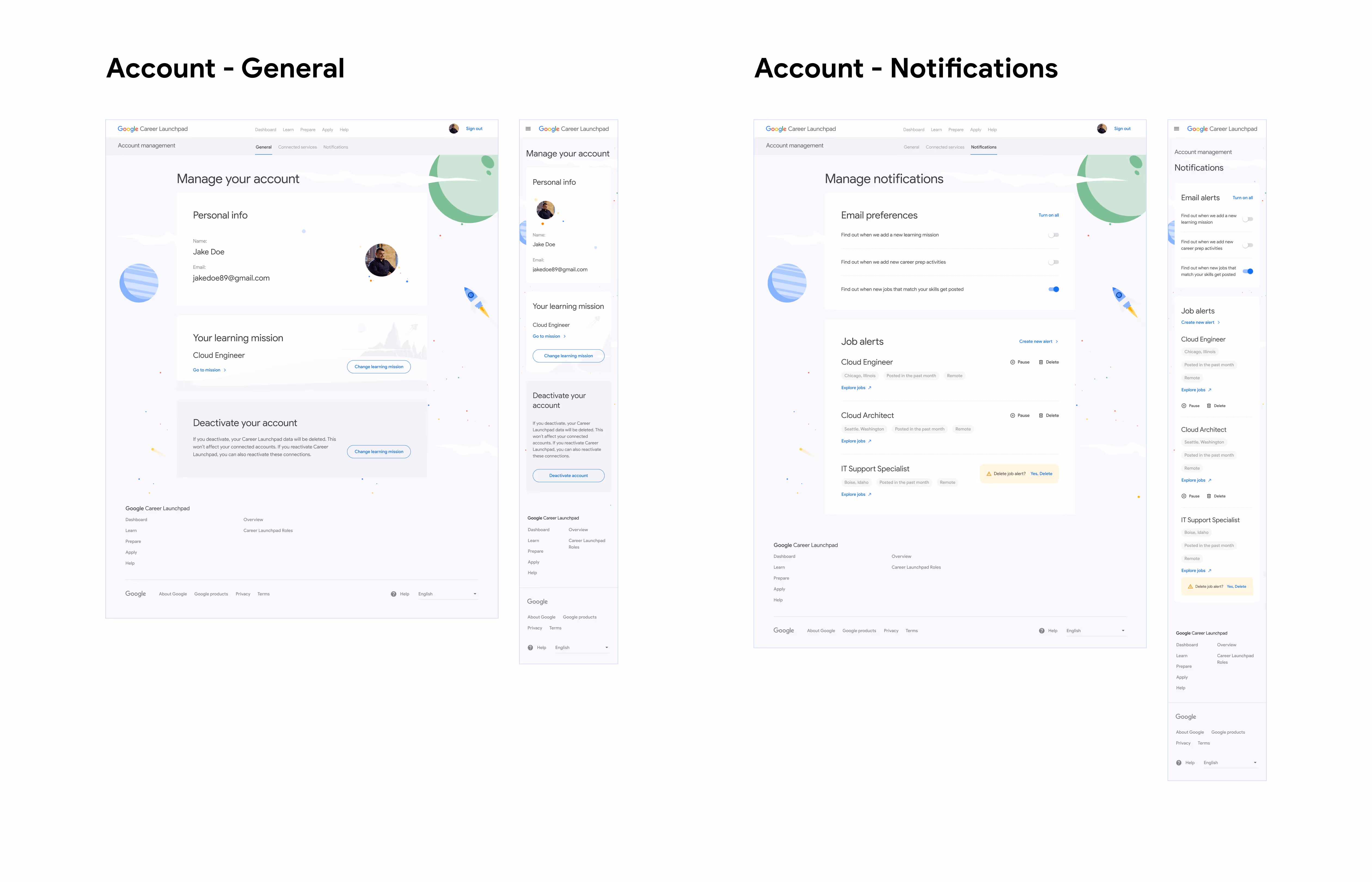
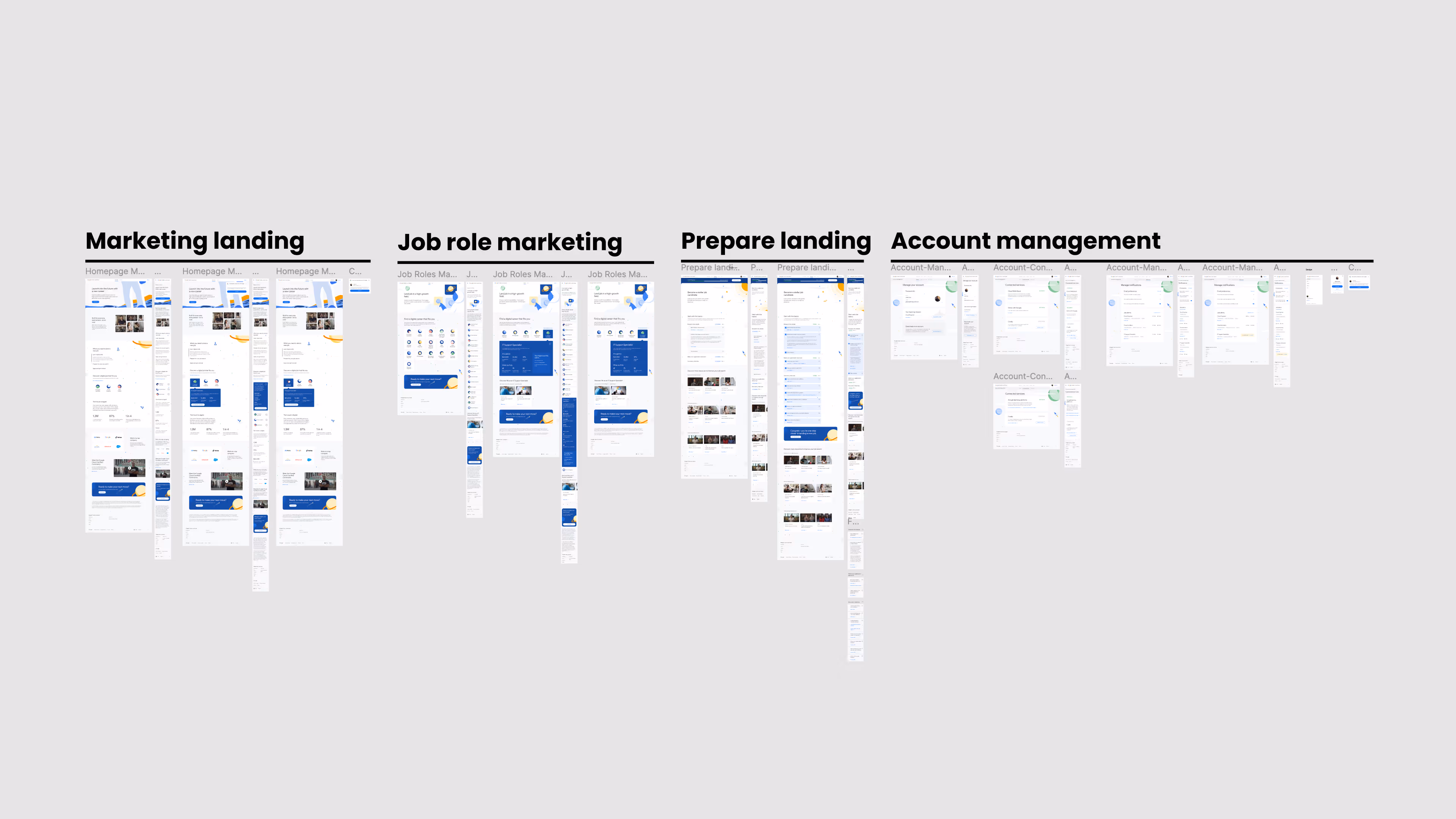
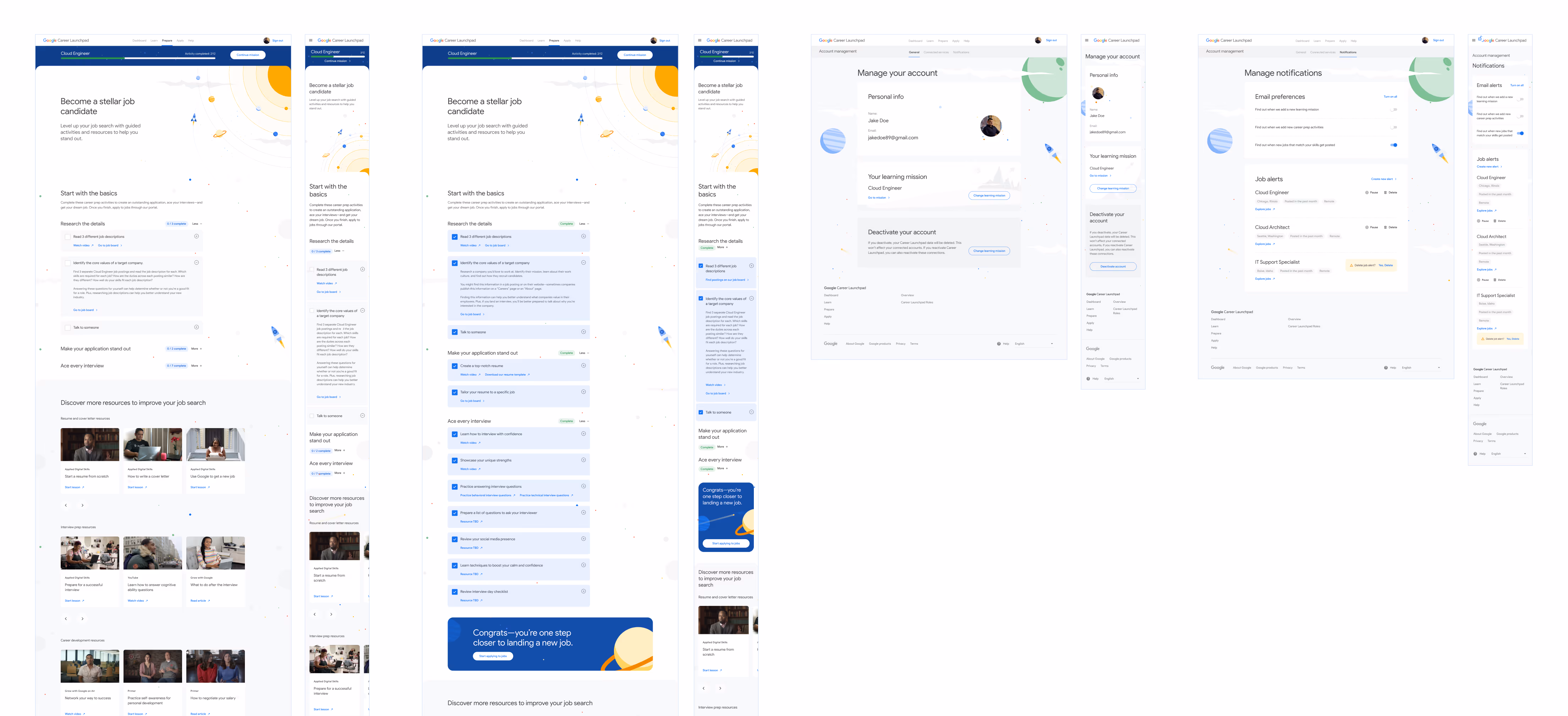
Sprint two focused on the marketing, job prep, and account management pages within the MVP experience. I owned the marketing and preparation pages, while our junior designer worked on account designs.
I spent most of my time in this sprint wireframing different variations of the marketing page, testing visual treatments that engaged on both desktop and mobile while aligning with the mapped content from our content blocking sessions. I collaborated in live Figma sessions with creative, strategy and copywriting to test narrative approaches, content hierarchies, and ways to effectively sell the product vision and value proposition to visitors.
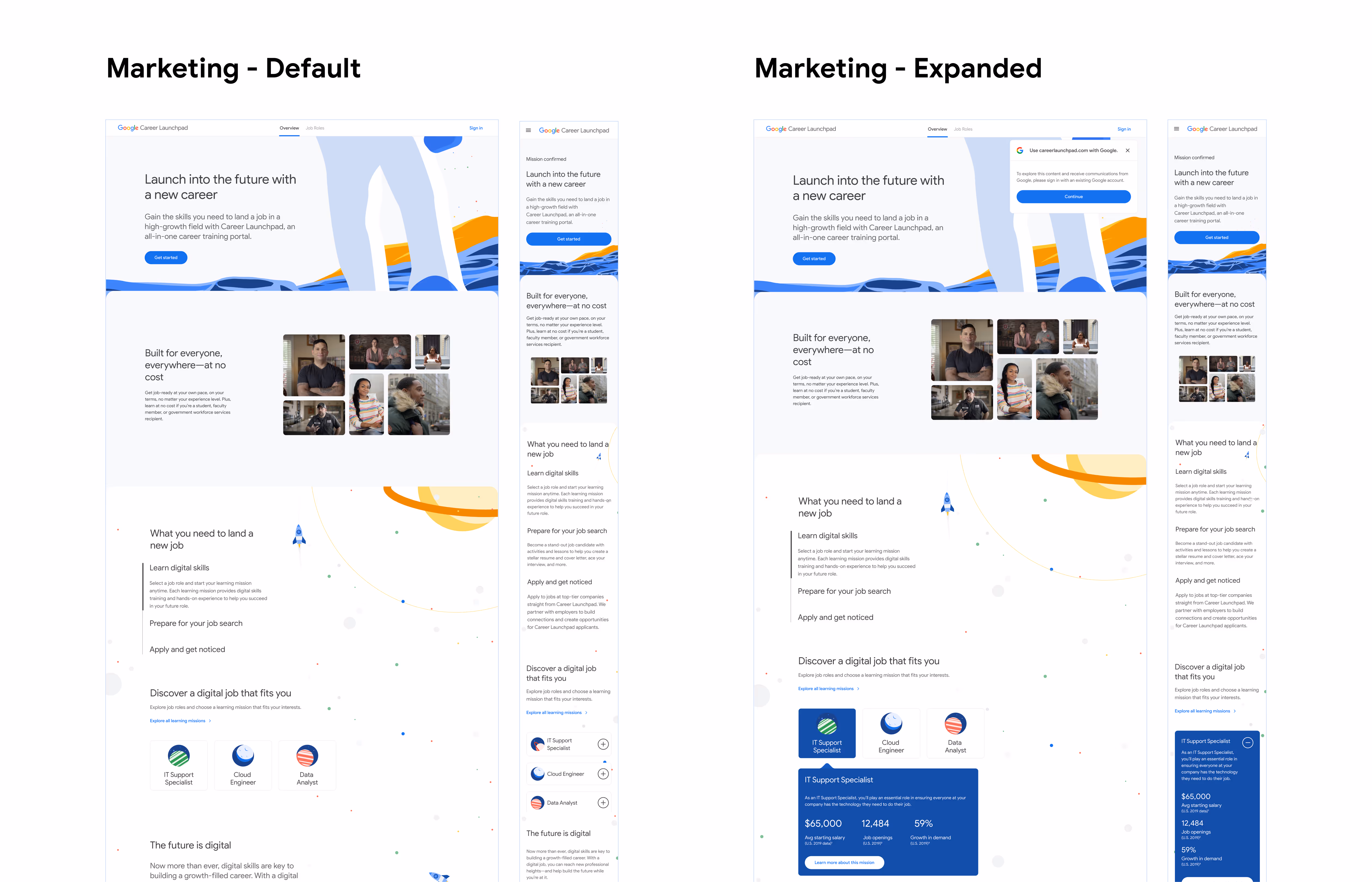

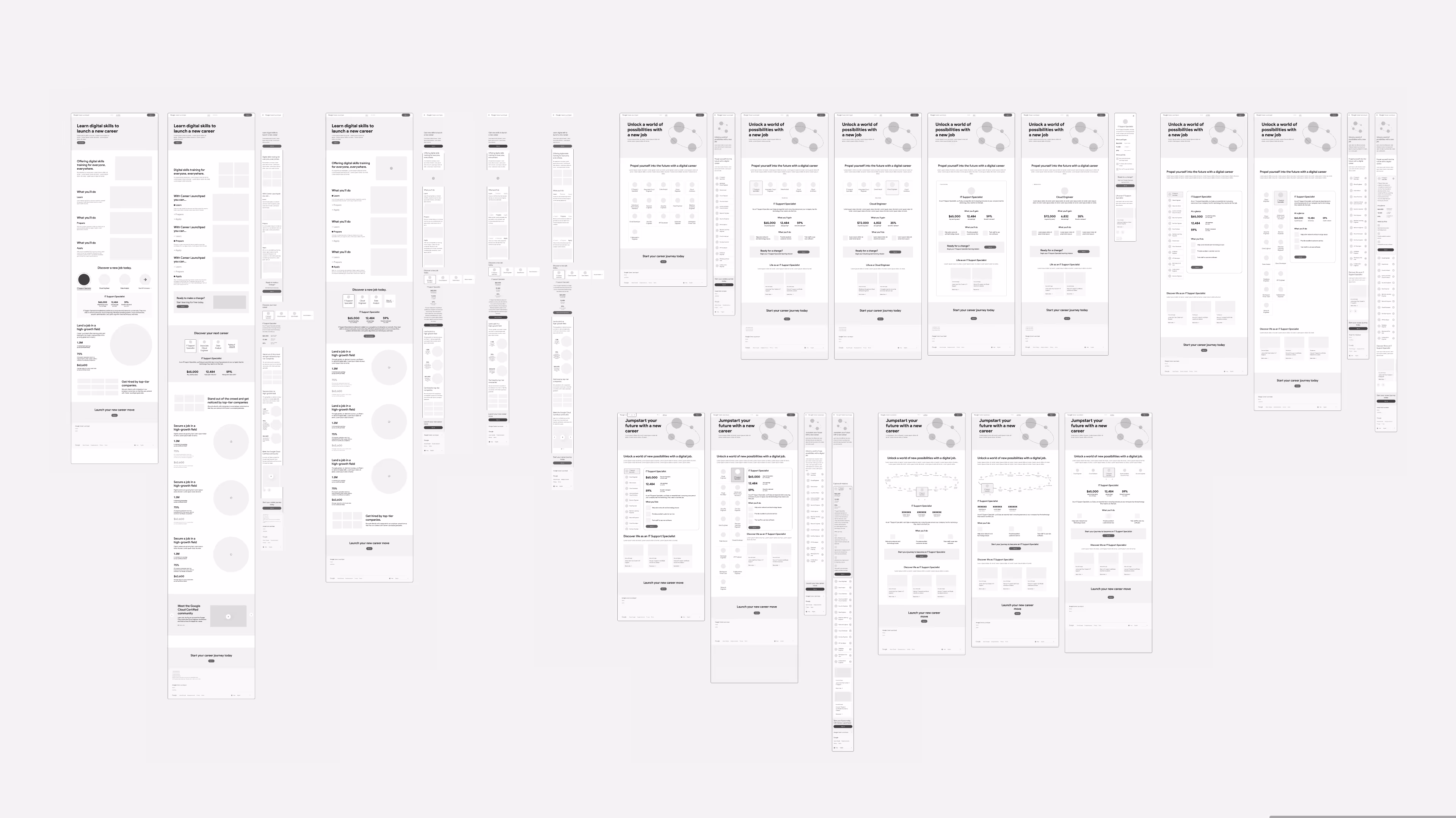
The Google team came back to us with clear requests regarding our visual approach, copywriting, and supporting content. I made a series of updates throughout our designs covering:
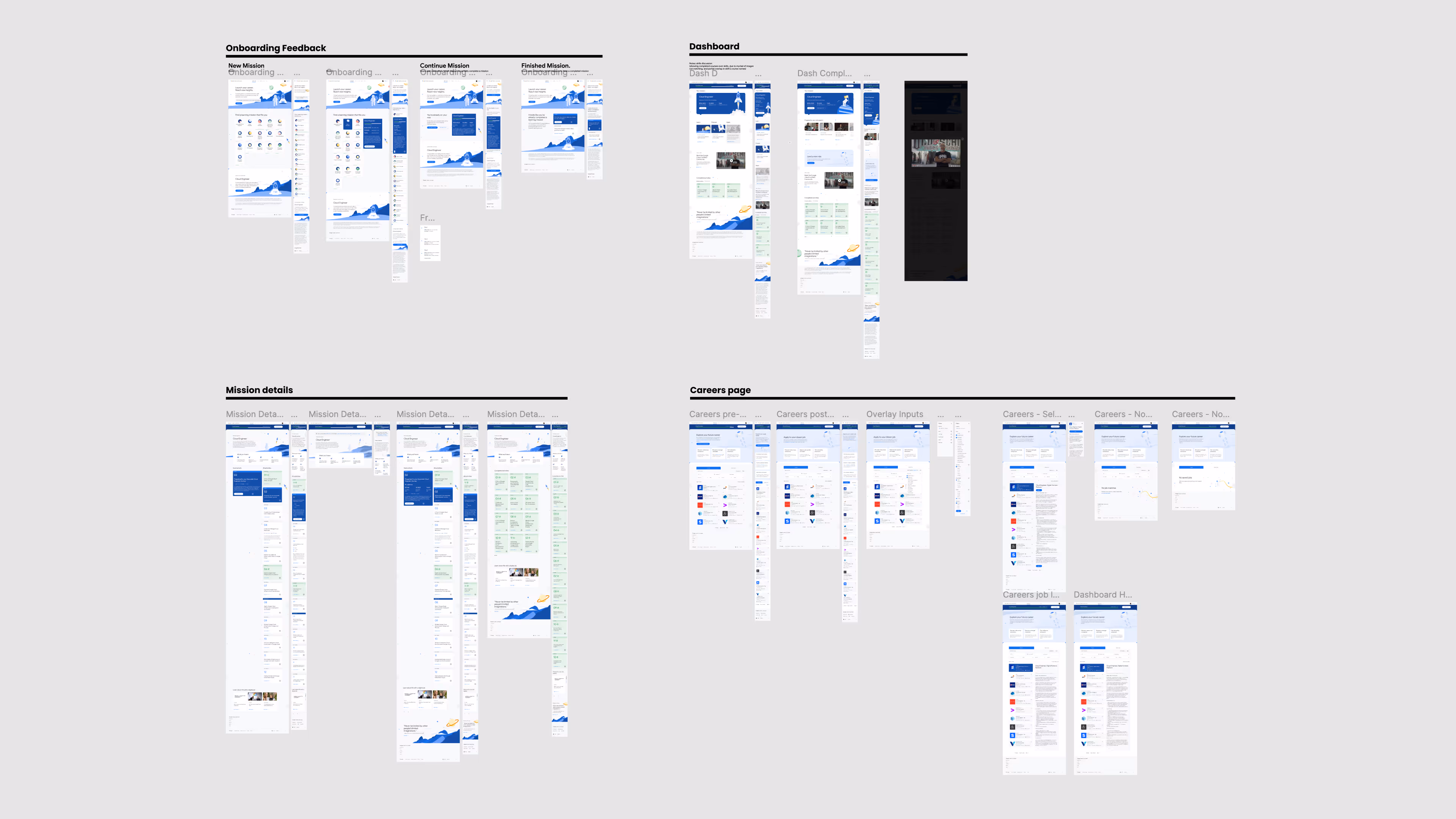
Our final sprint mostly dealt with dotting the i's and crossing the t's of our MVP via user guidance features: an in-app notification system, interactive platform tour, help/FAQ page, and email designs.
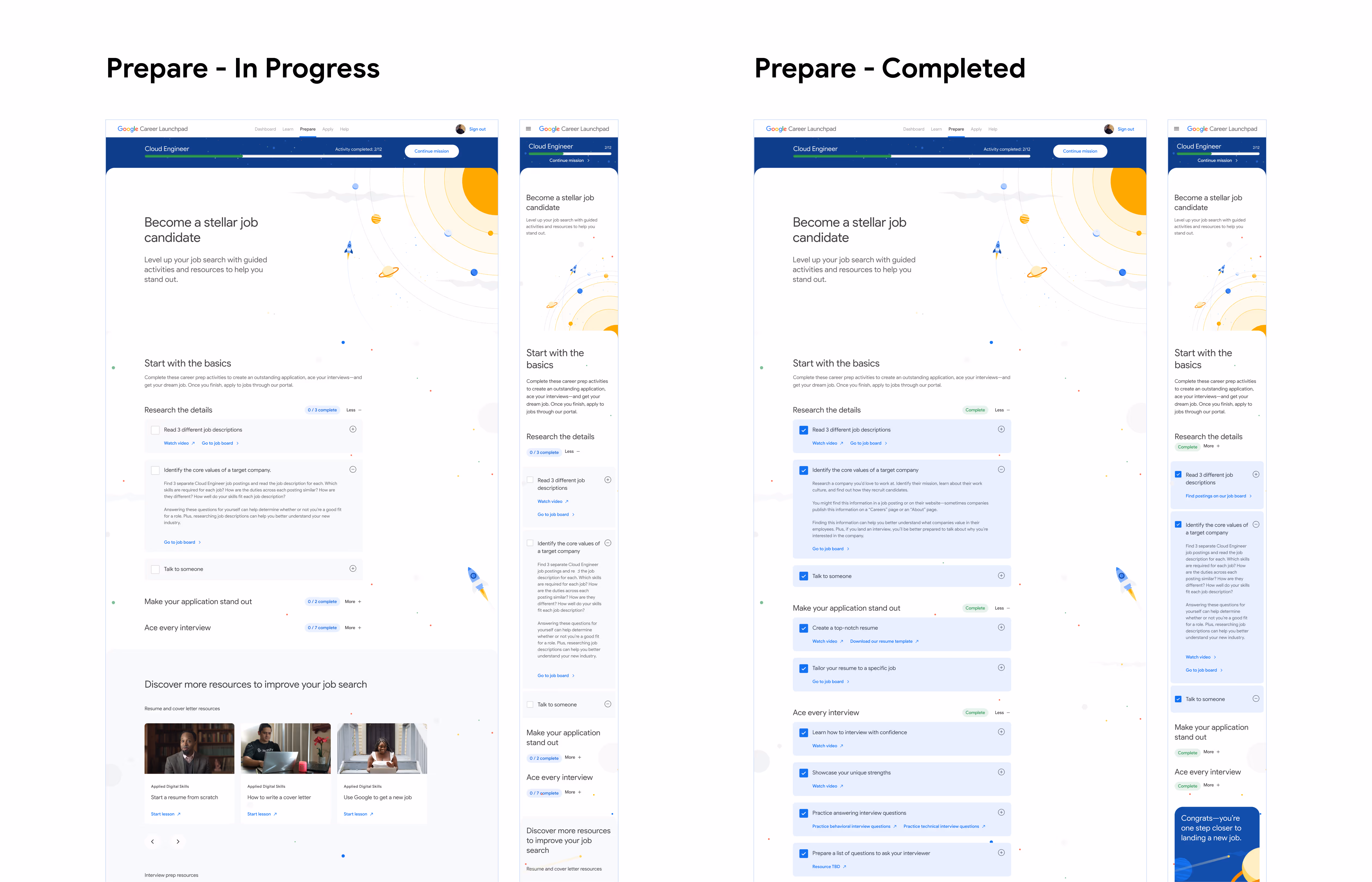
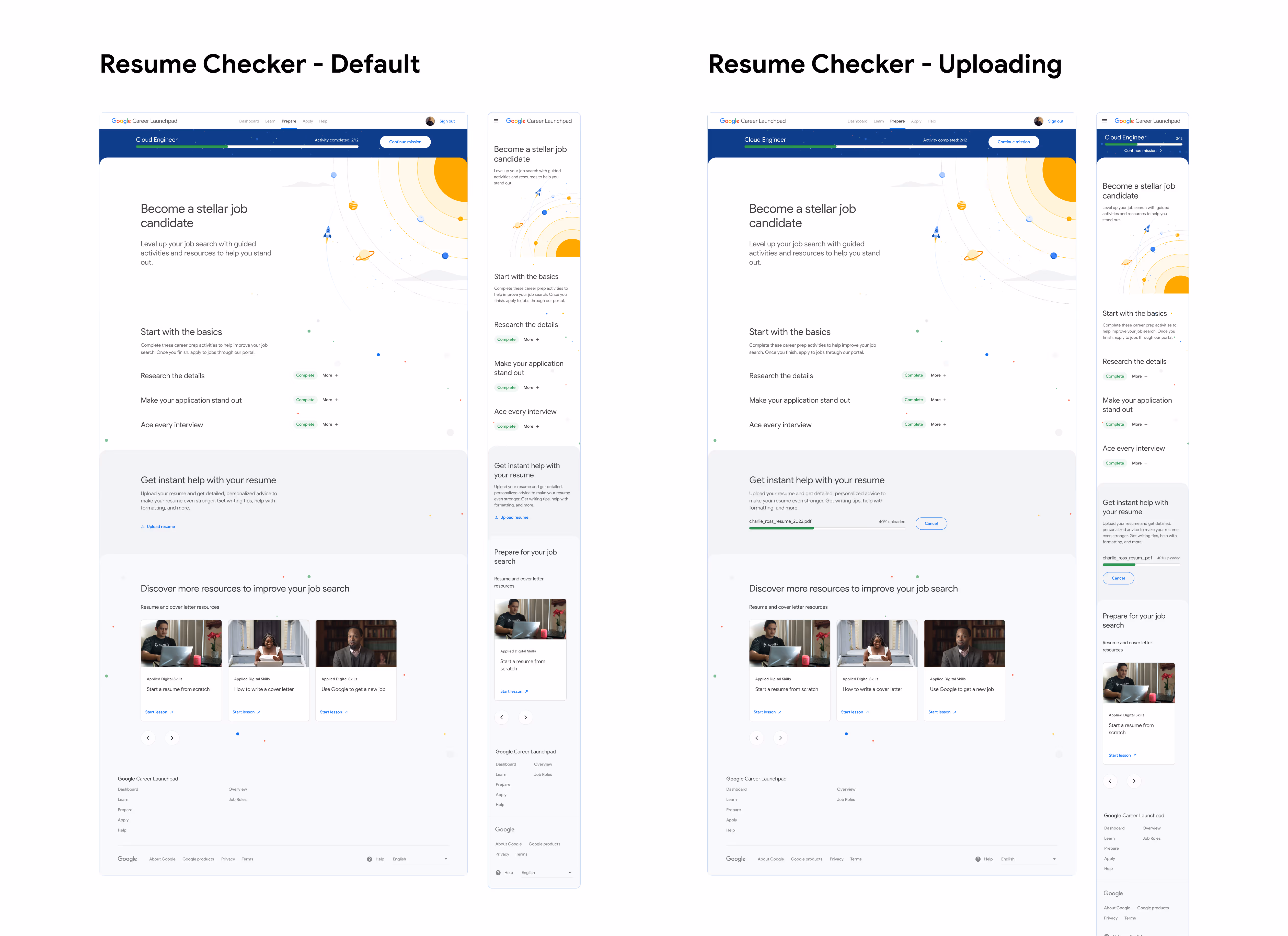
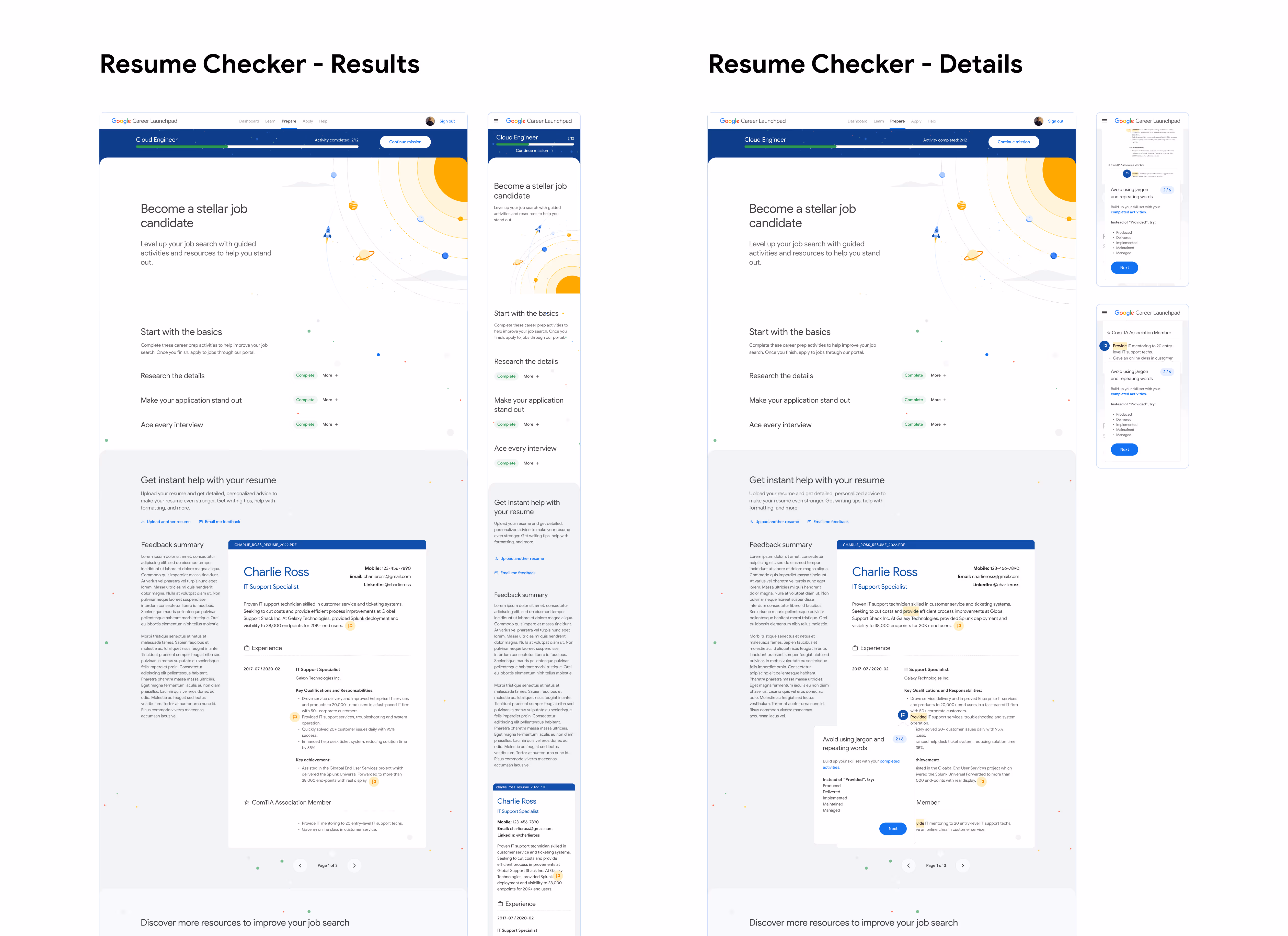
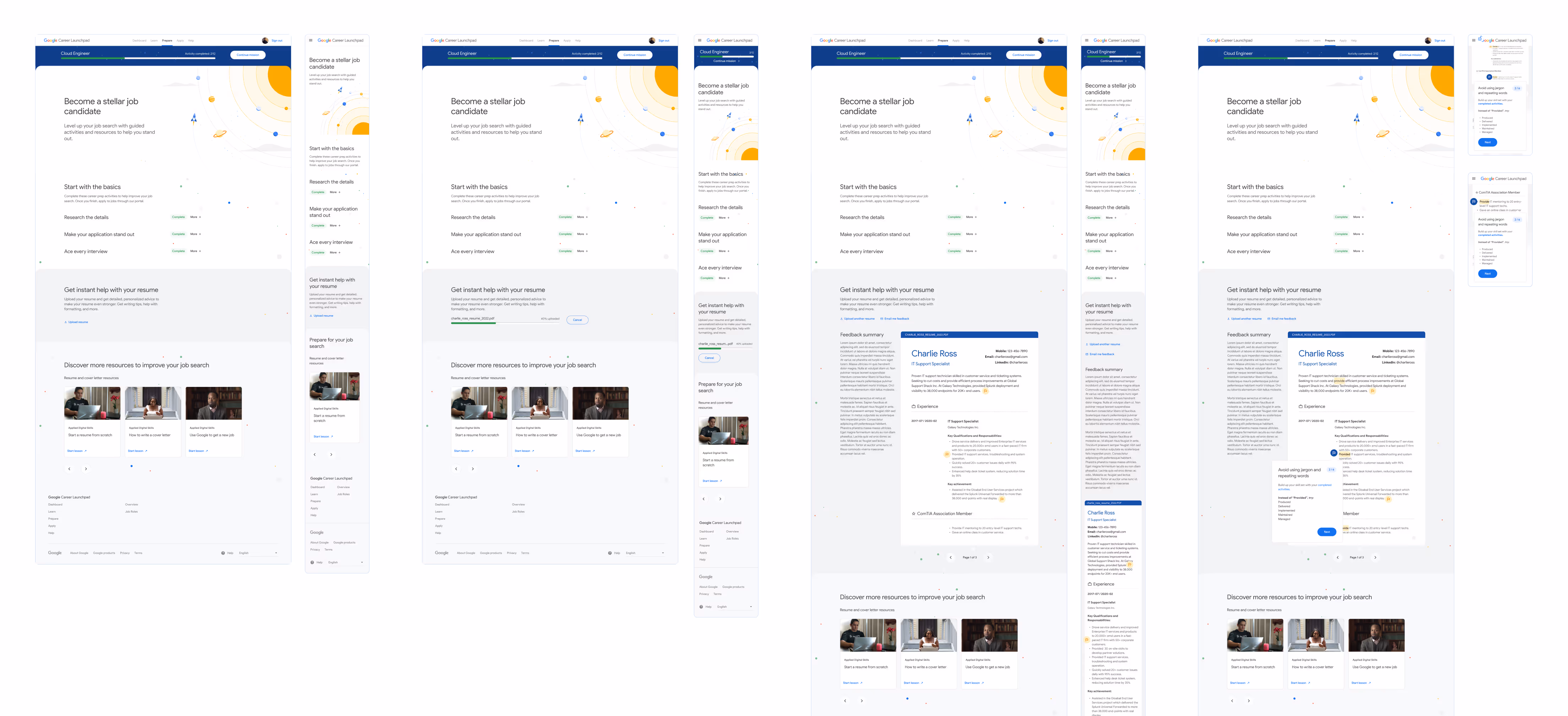
A last minute request from the Google team came through mid-sprint: they wanted a resume-building tool within the platform. This feature was discussed at the outset of the project, but was deemed too heavy of a lift by our technical lead. Although out of scope, our team understood the desire for more resume guidance within the platform.
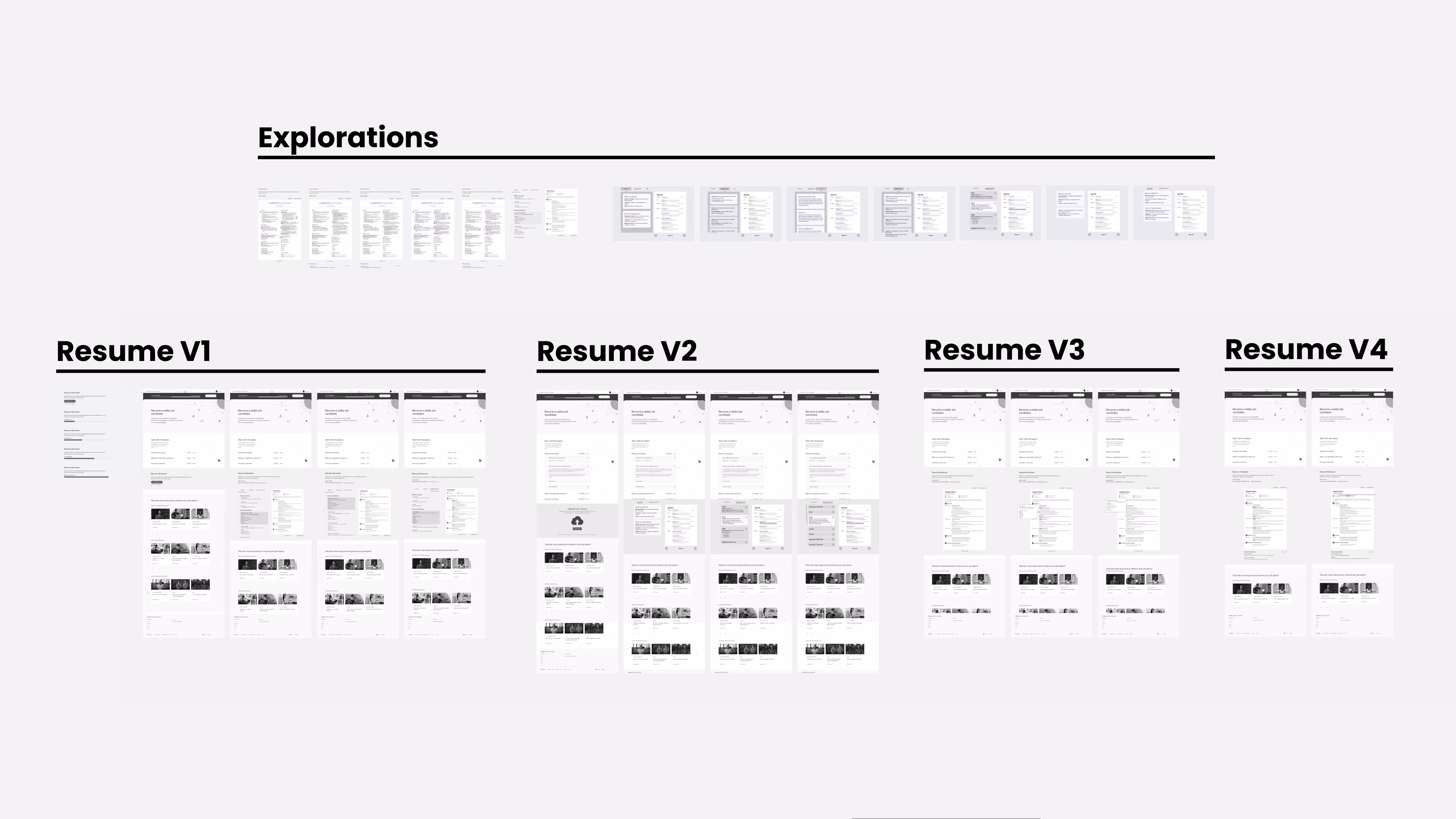
As a compromise, we added a resume reviewing tool to the job preparation page. Here, users upload their resume to the tool to receive improvement tips and recommendations. I quickly made wireframe versions for client review, and created fully designed screens for our handoff files.
The process was not without its challenges. This was a fast project that expected timely, high-quality delivery with a short turnaround. The waterfall method of larger organizations didn't exist here; changes could come at any time and needed to be implemented immediately, and properly, to meet the project deadlines.
This initiative showed me how strong teamwork and open, cross-disciplinary communication leads to quality creative results and quick adaptation to shifting project priorities. My team at Huge absorbed a huge amount of discovery documents, performed under high-pressure sprint timelines, proactively contingency planned to keep the project moving forward over any obstacles, submitted numerous deliverables, and provided an MVP that really delighted our stakeholders, surpassing their expectations.